 2021 – 2022
Voiceflow is a platform for building AI agents: customer support bots, voice assistants, and multi-channel conversational experiences. In 2018 the company acquired Invocable, where I had designed the original UI. Three years later I came back to redesign it.
Focus
Voiceflow started as an Alexa skill builder. By 2021 the business had moved past that. The app needed to work for a wider range of use cases and customer types.
I needed to rethink the underlying systems. Not just fix what was broken, but build something that could scale as the product grew.
The core question: how do you let someone build a non-linear conversation using a mind-map interface?
I focused on four things:
Usability and accessibility
Rebuild the UI to cut the number of actions needed to do anything. Bring the product and brand identity closer together.
Learning and adoption
Make onboarding teach best practices for building conversations. Document every feature. Push people toward shortcuts.
Multiple user roles
Designers, developers, and business owners all use the tool differently. The interface had to serve each role without drowning anyone in options.
Error tolerance
People build things we don't expect. The design had to handle any combination of features and make recovery easy when something breaks.
Scope
Most of the work went into rethinking features, improving usability, testing, and visual design. This case study covers only the conversation design tool — signup, dashboards, and other flows are left out.
Observation
- Watching user sessions
- Working with support and backlog
- Defining areas of improvement
- Analyzing competitors
Hypothesis validation
- User experience questionnaire
- Tracking of product events
- Customer development sessions
- User segmentation
Analysis & decomposition
- Describing user flows
- Converging UI and business metrics
- Designing information architecture
- Conducting usability audit
- Prioritization and estimation
- Scoping of the first versions
Implementation
- Building an atomic design system
- Designing UI mechanics & shortcuts
- Migrating existing projects
- Writing specifications
- Mapping feature dependencies
- Creating a rollout plan
Product research
The team already had structured personas and a backlog of feedback when I joined. My first job was to define which usability metrics mattered most and connect them to business goals.
Areas of improvement- Engagement and functionality
- Ease of use and intuitiveness
- Adoption
- Aesthetics and accessibility
- What do customers and the business expect?
- What's preventing that right now?
- What could fix it?
- Engagement metrics: session length, session count, test runs
- UEQ scores before and after the redesign
- Support requests and qualitative feedback
- Team interviews
- User interviews and usability testing
- Usability audit
- Session recordings and product analytics
- Competitor analysis
User research
The redesign had to work for designers, content managers, and engineers. I started with the people using the product.
QualitativeCustomer interviews, feedback sessions, and session recordings. I watched how people actually used the tool and where they got stuck.
QuantitativeUEQ surveys for usability scores, event tracking for feature adoption, quick surveys for sentiment.
What I foundMany conversation designers also used Figma, FigJam, and Sketch. I borrowed patterns they already knew: reusable styles, component-based structure, keyboard shortcuts.
Rethinking conversation building blocks
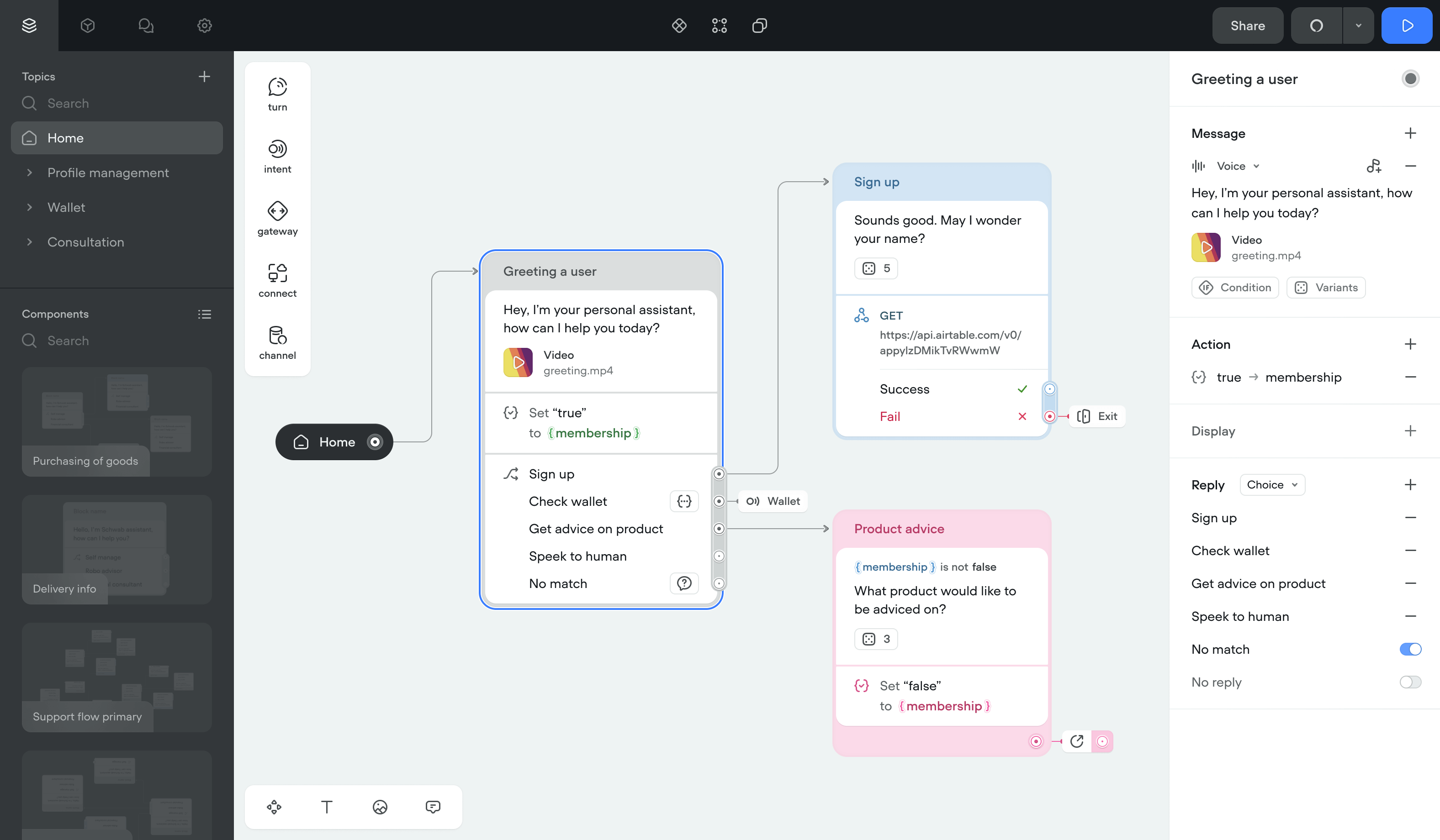
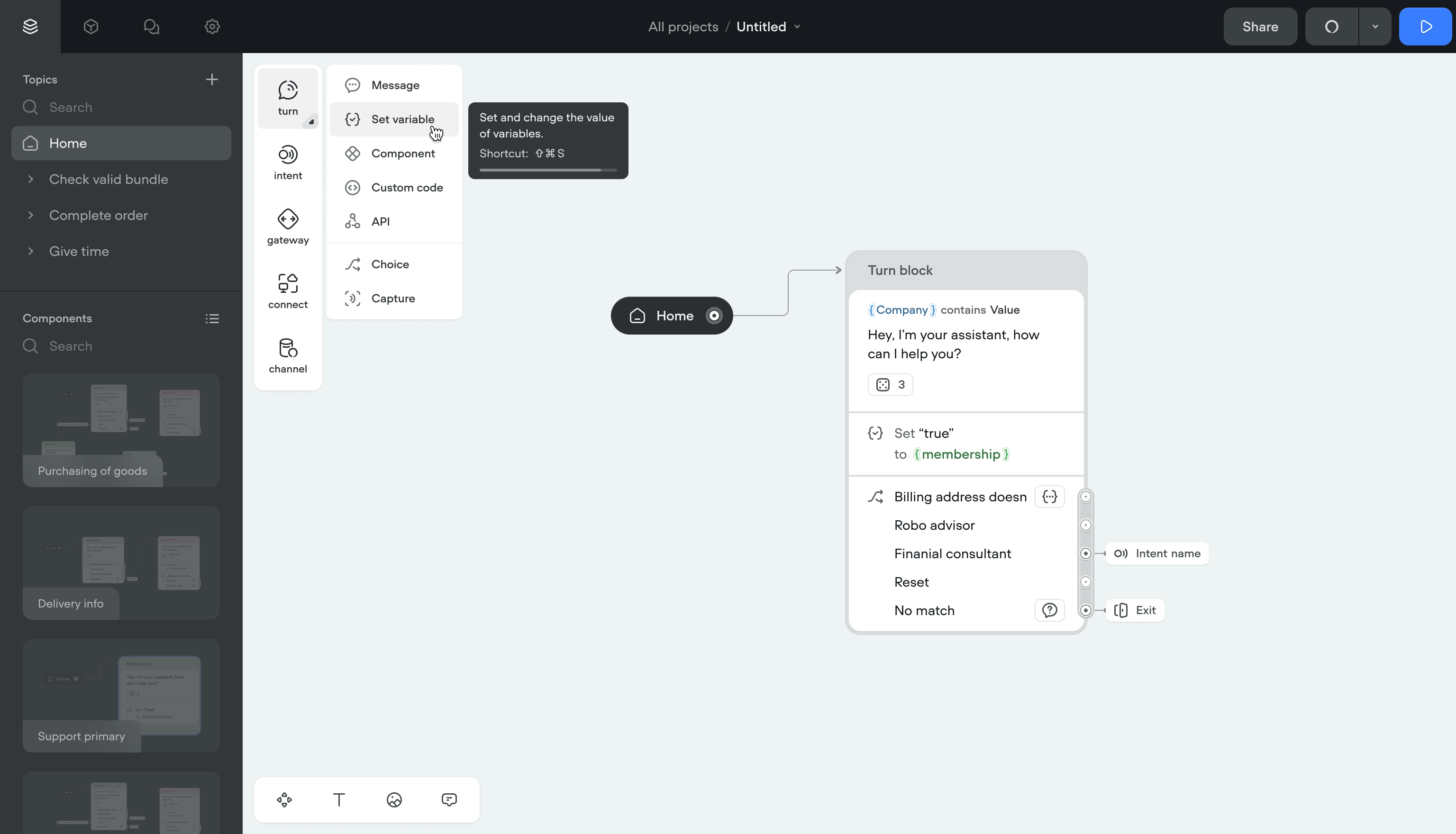
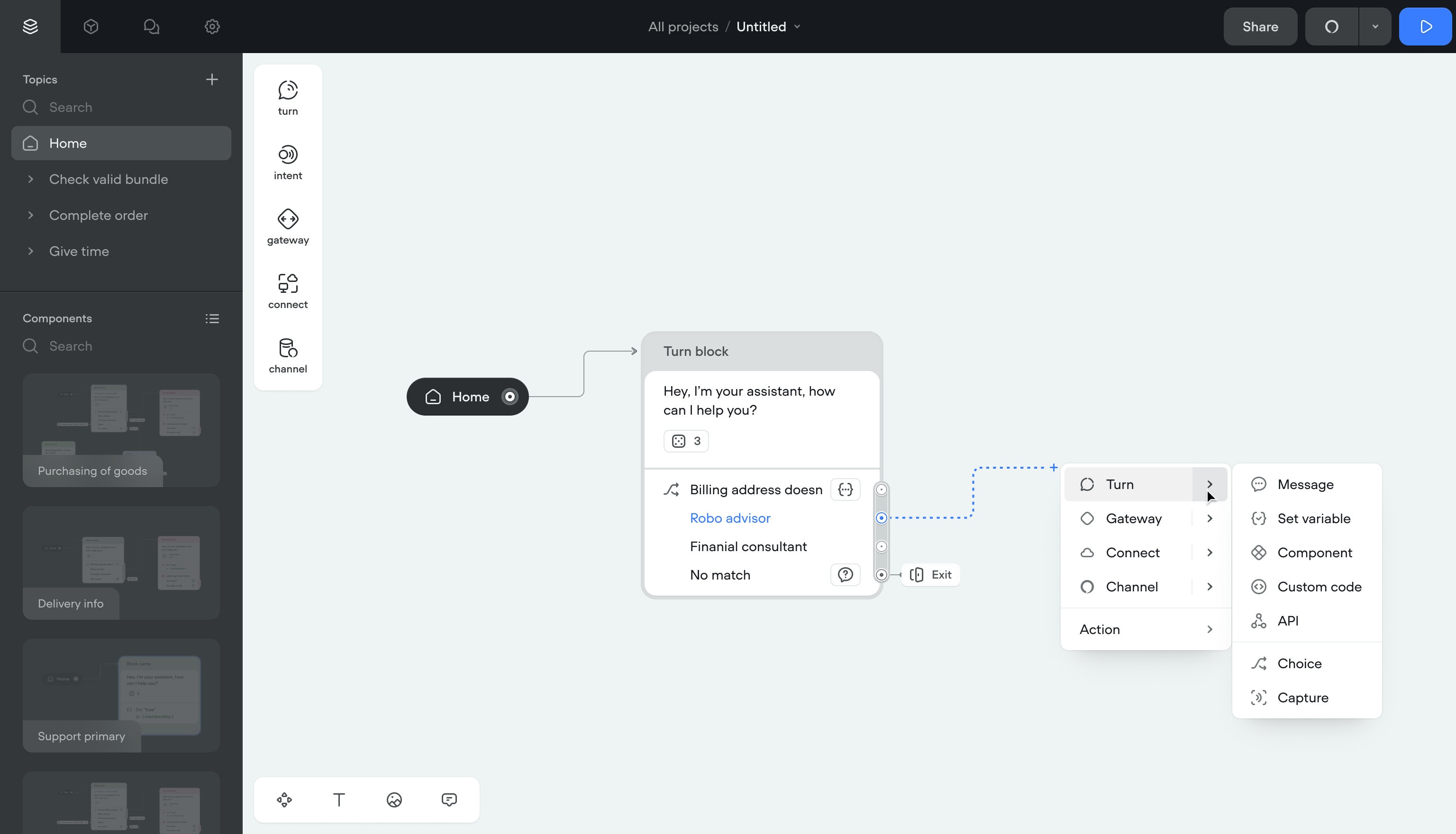
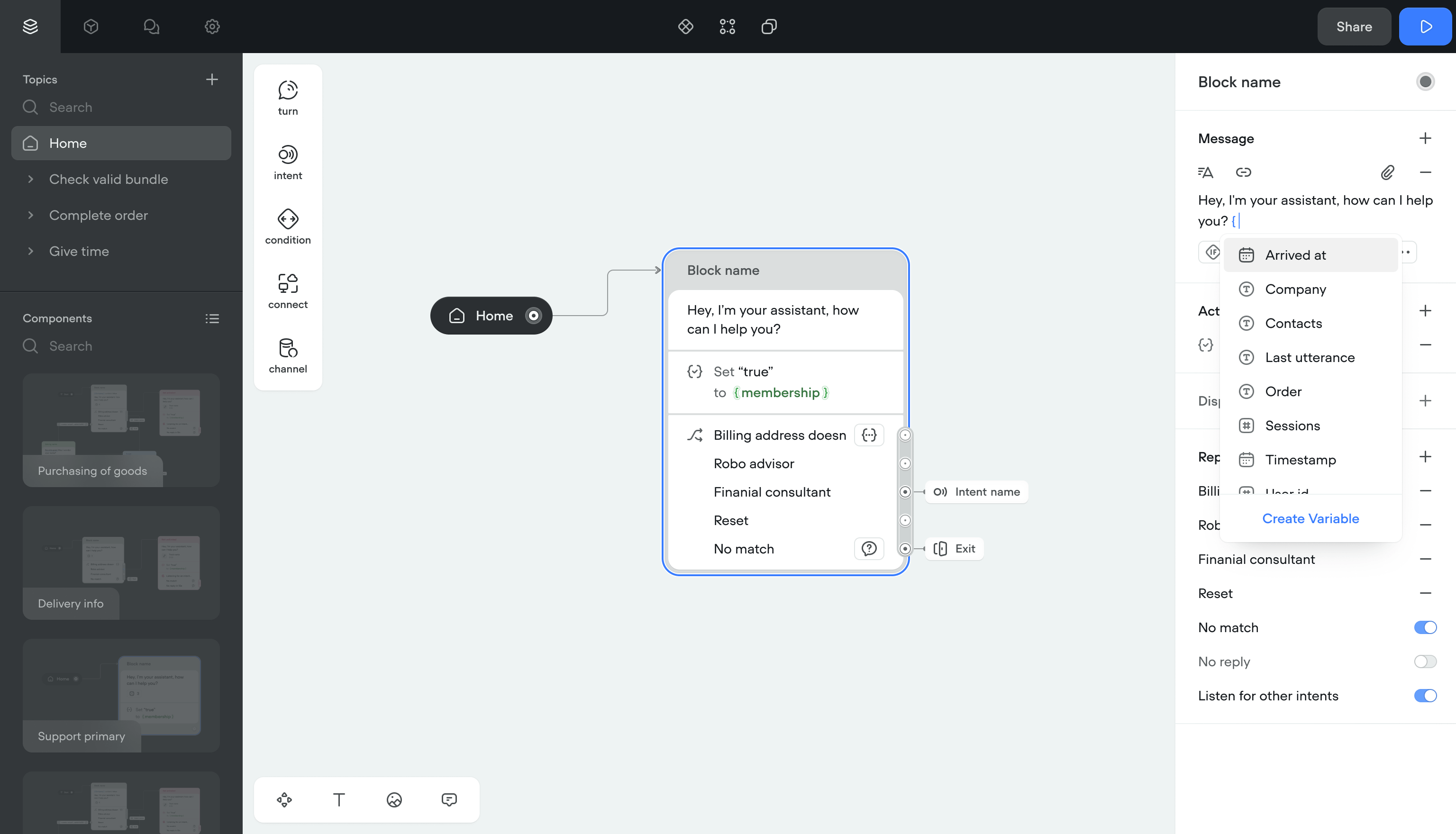
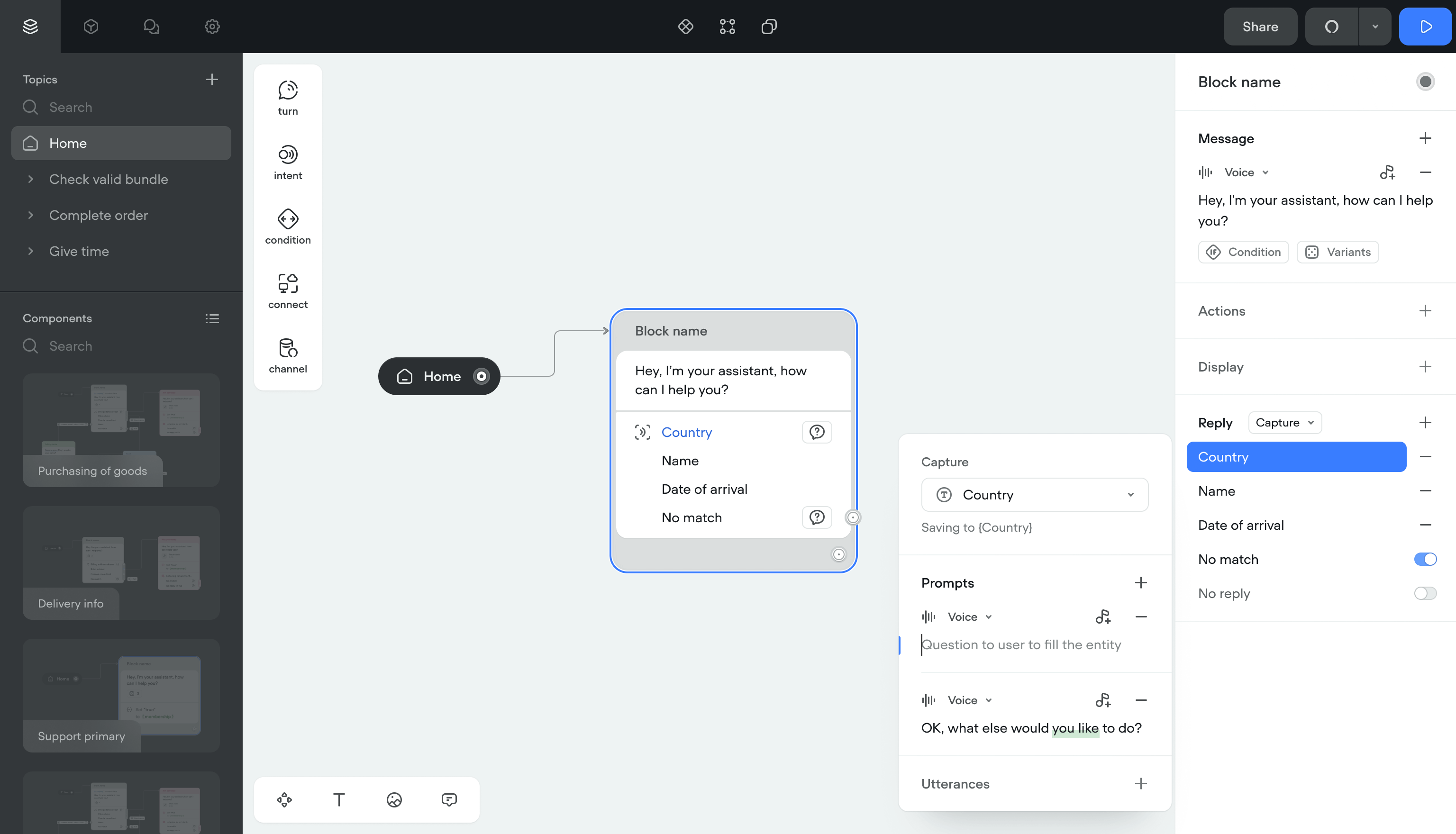
In Voiceflow, the basic unit is a block: a grouped list of steps the system runs in order.
I grouped what used to be separate steps into Turns. A Turn is a template with configurable properties. The structure underneath stayed the same: blocks connected by transitions.
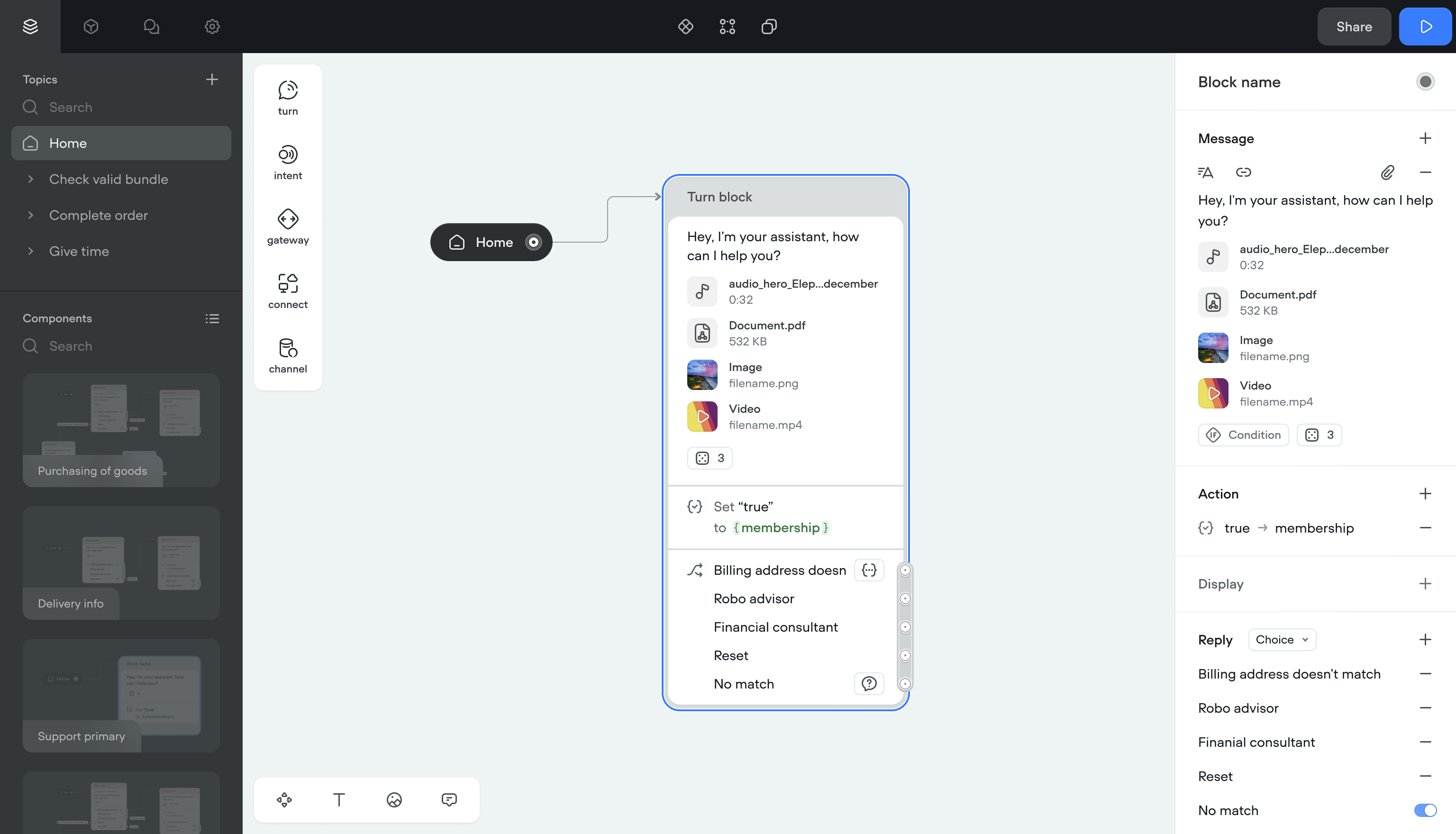
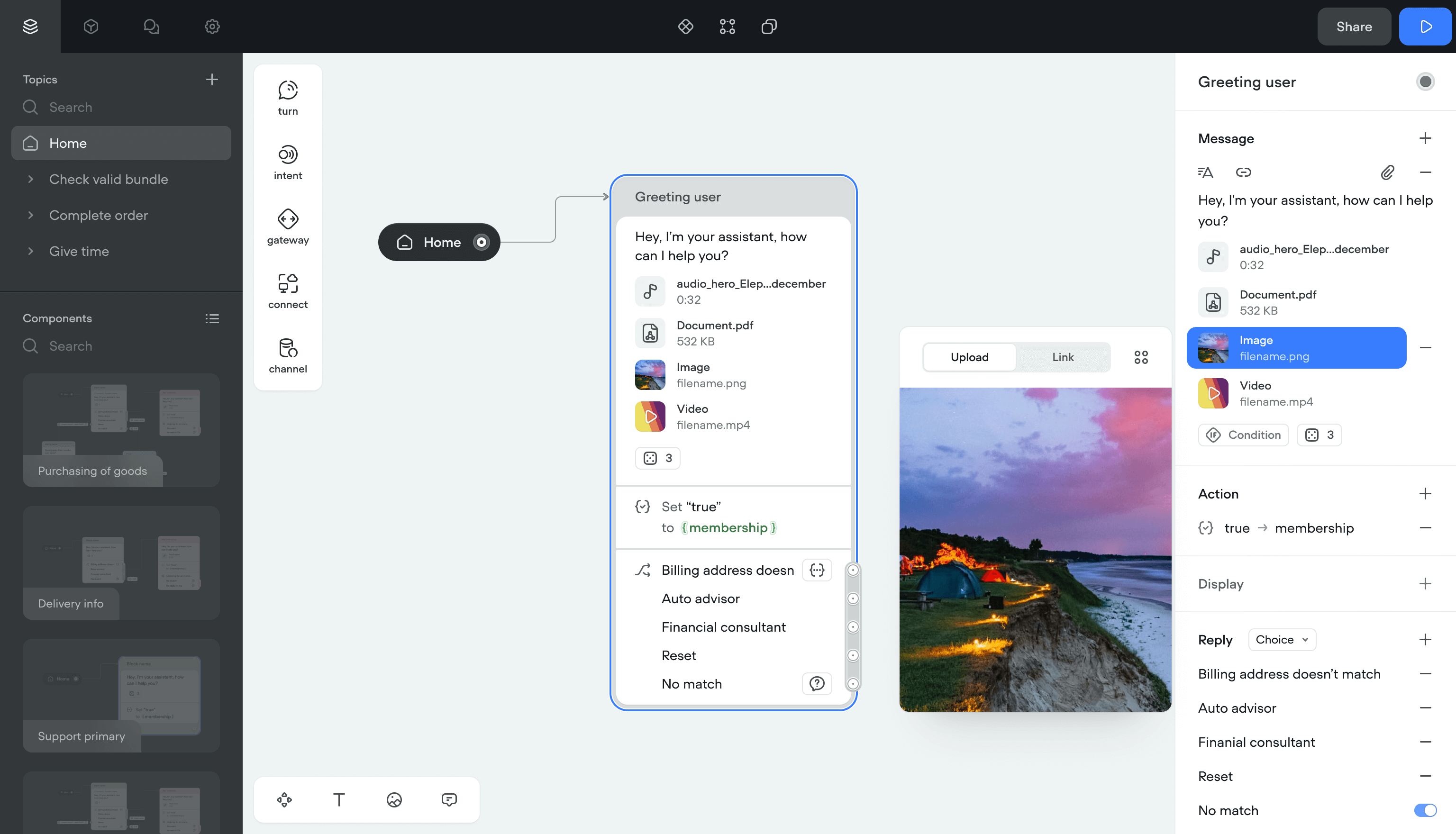
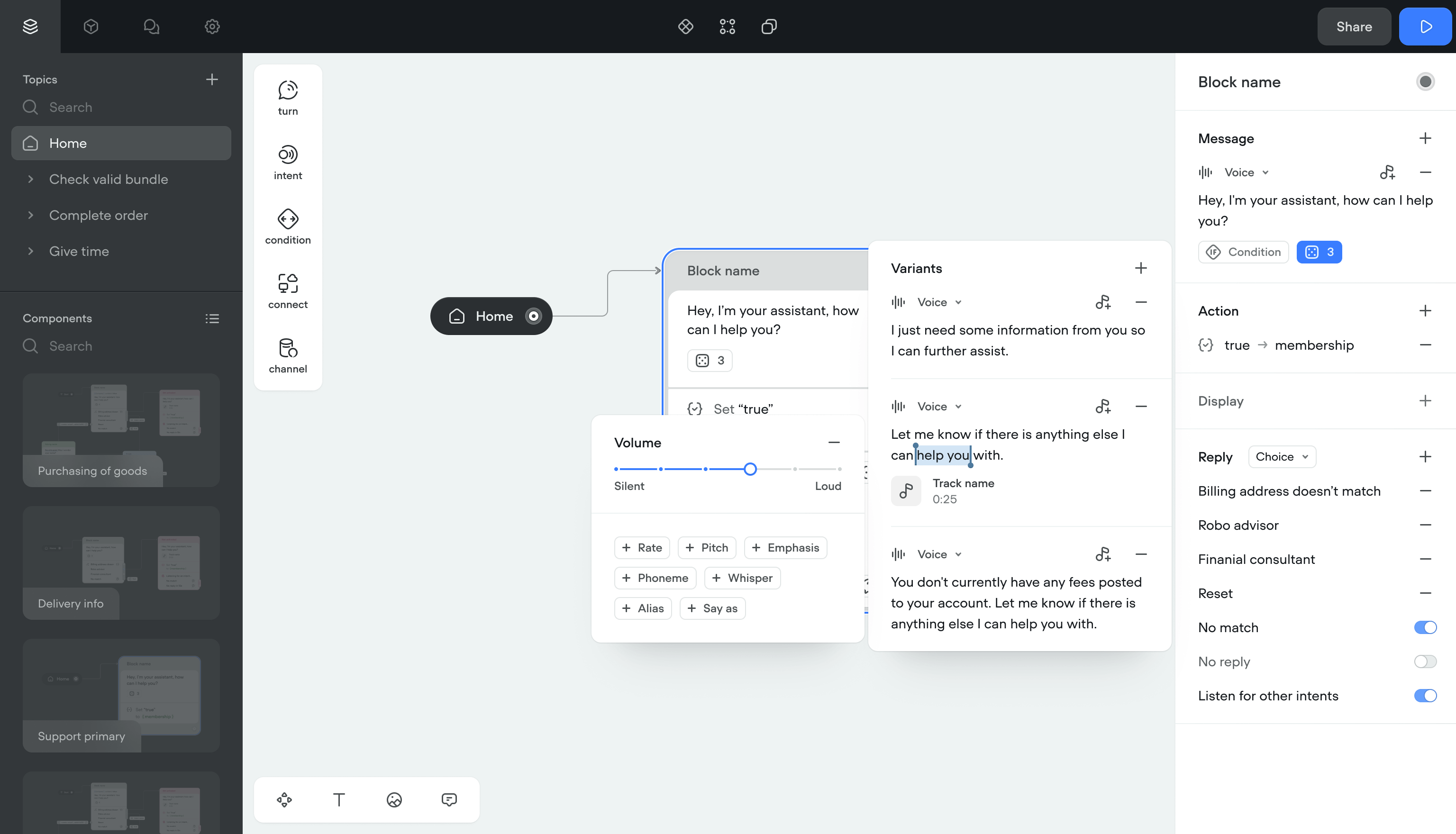
Message
A Message is what the assistant sends to a user, either automatically or in response to input.
Before the redesign, there was no single message entity. Text, image, and audio were separate steps. I unified them into one component, same as the Turn approach.
Attachments
Once messages had a single structure, I added attachments: reusable content blocks that can be combined with any message. This was the first step toward a content management system.
I also added video and document attachment types for text channels, since the product was scaling toward those formats.
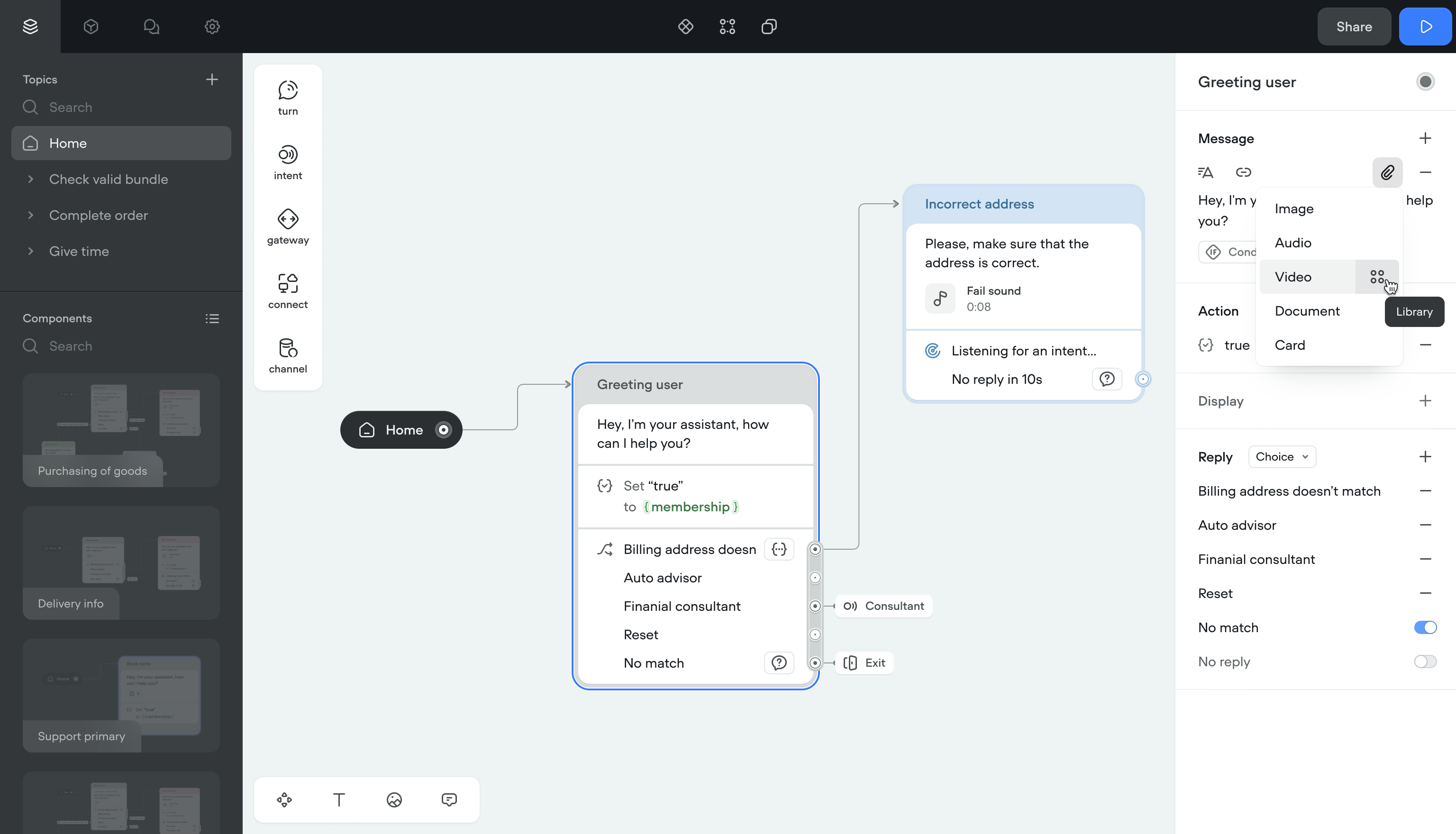
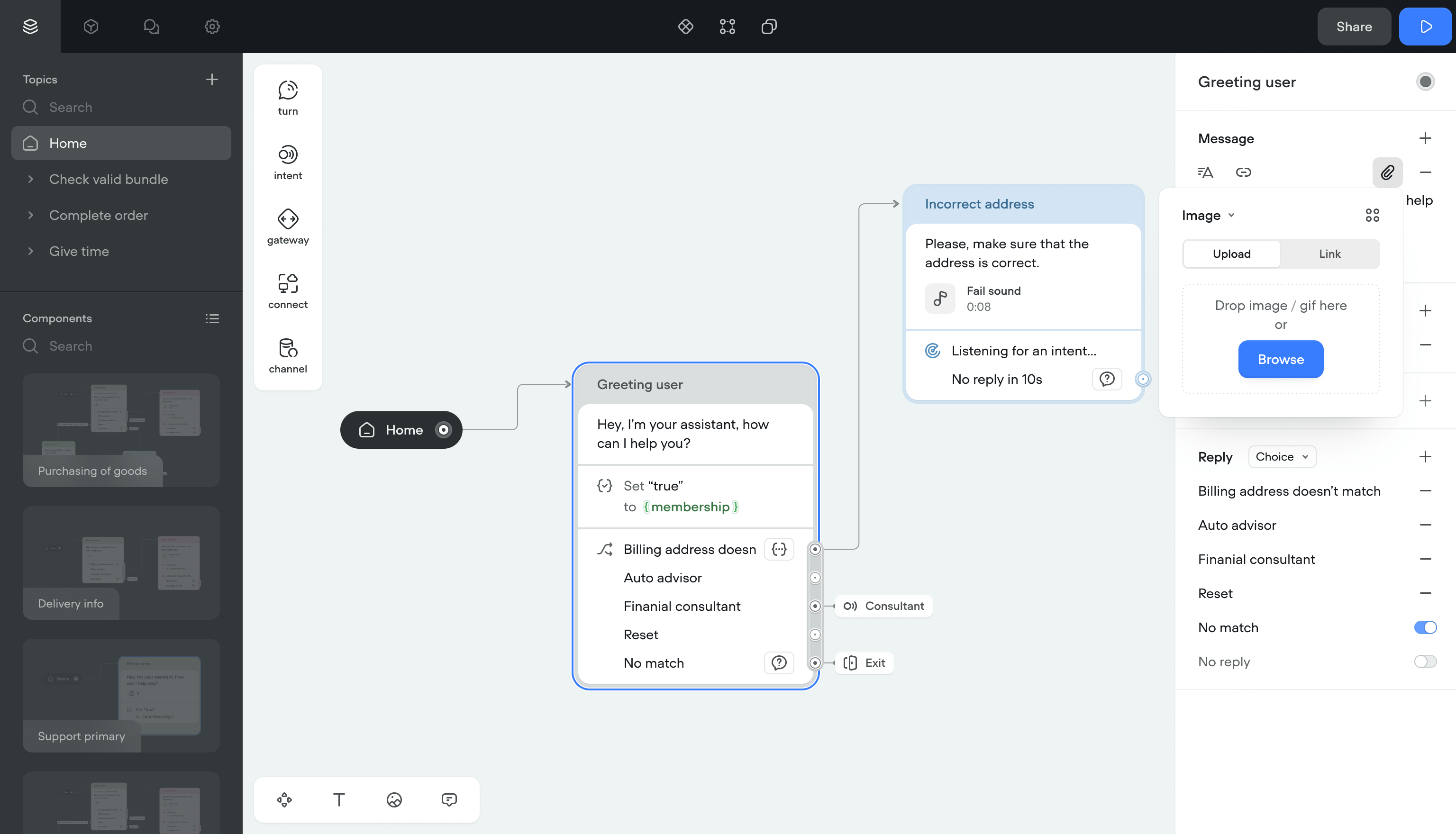
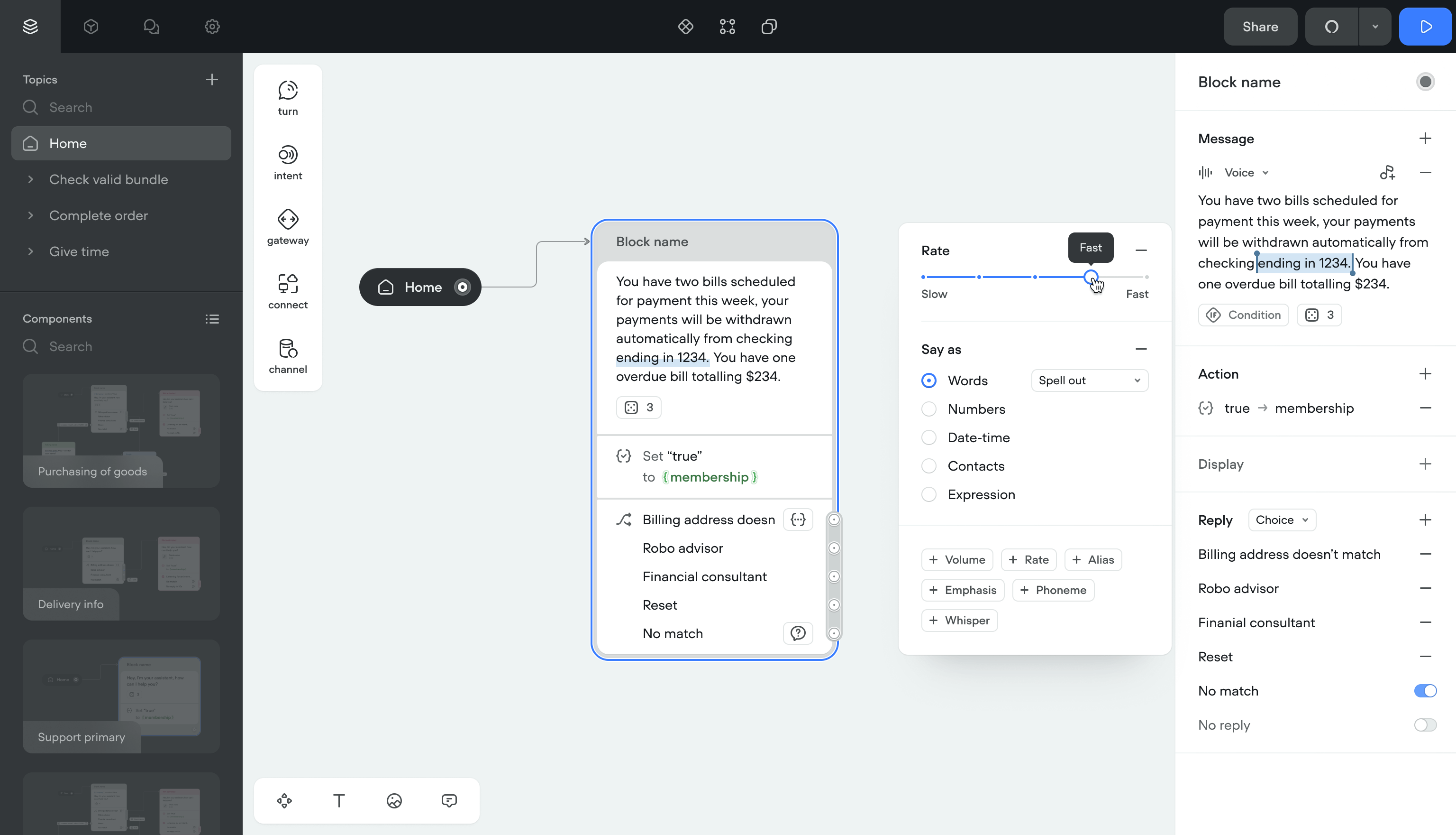
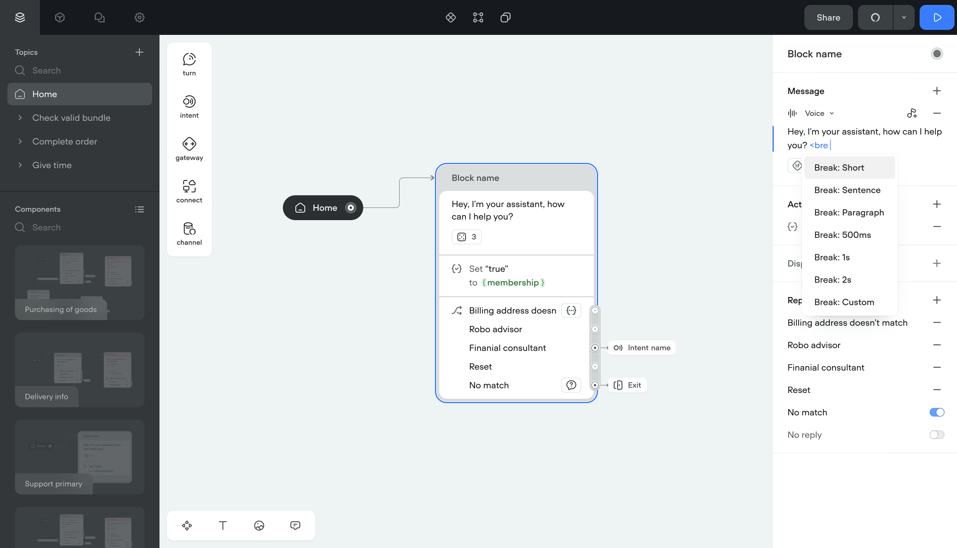
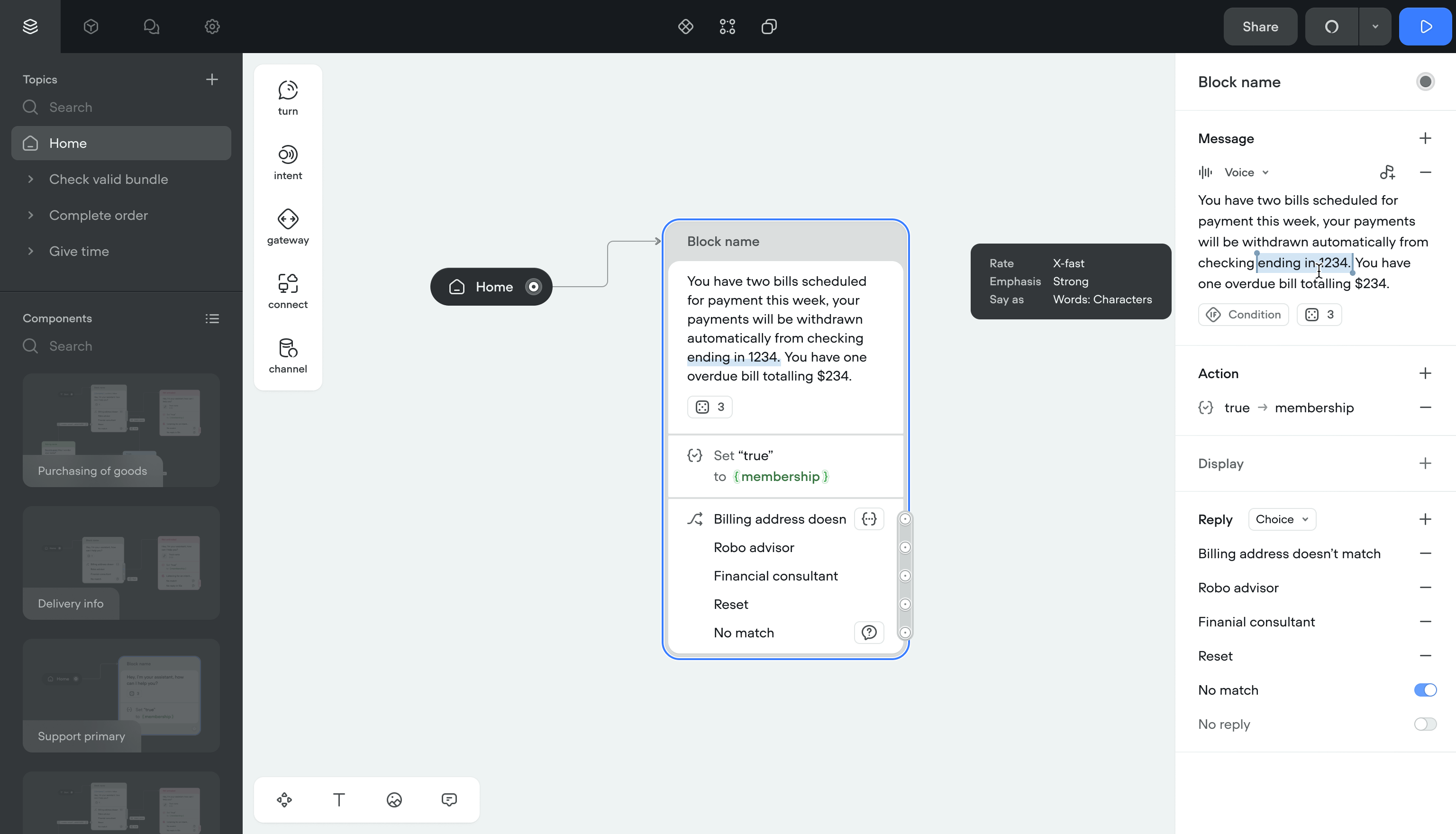
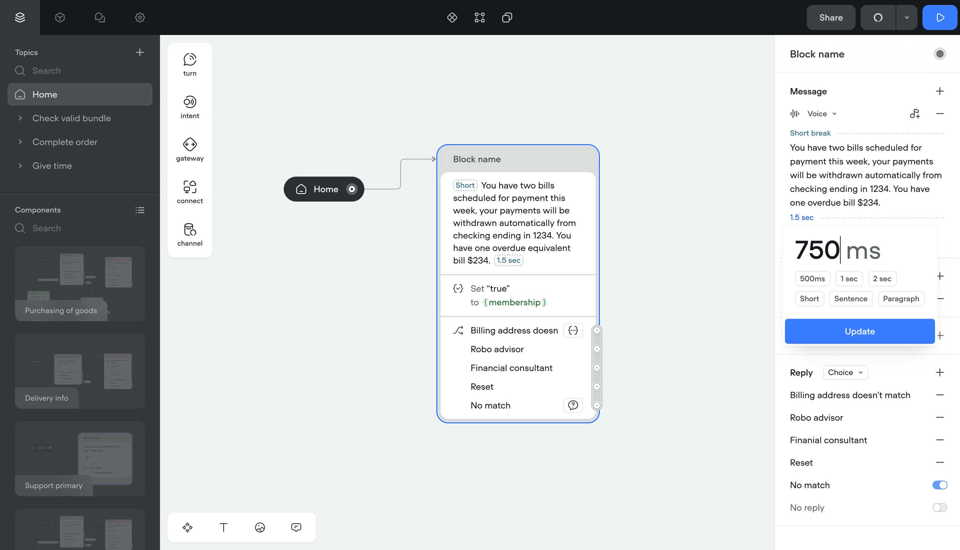
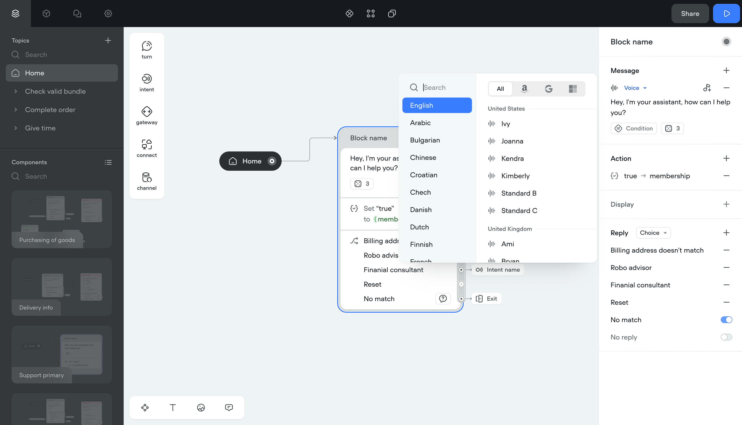
Voice effects
SSML effects were applied by typing raw tags into message inputs. Users had to memorize tag names and spell them right. Selecting accents and voice providers meant navigating a 3-level nested menu.
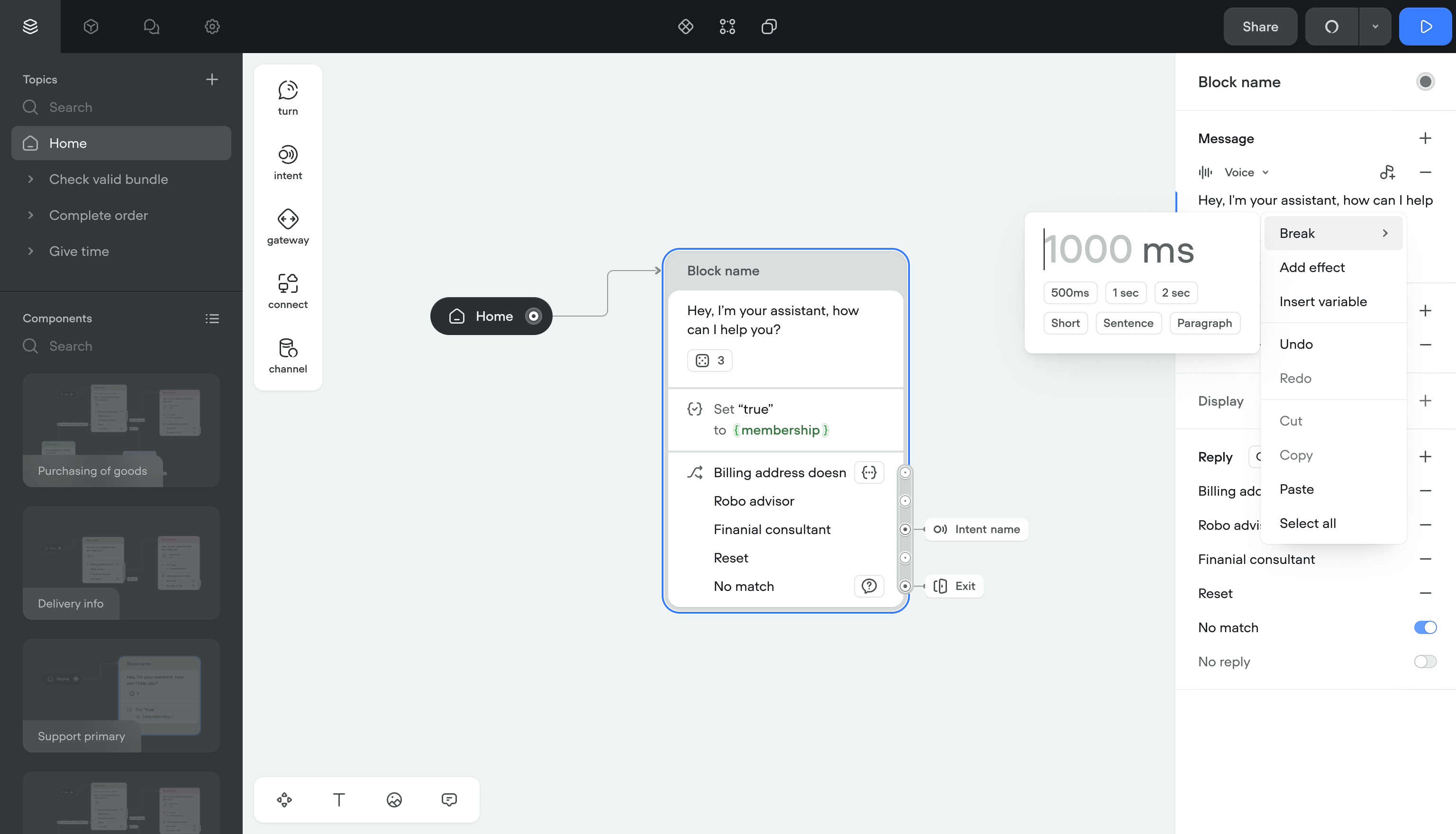
Solution- Right-click menus, autocomplete, and text selection for applying effects
- Simpler naming throughout
- Clean display for applied tags, even with multiple effects stacked
- Error prevention for conflicting effects
- Flat list of accents and voice providers instead of nested menus
- Quick filters by channel (Google, Alexa, Custom) and project language
Applying voice effects went from a memorization exercise to a visual workflow. The nested menu was gone.
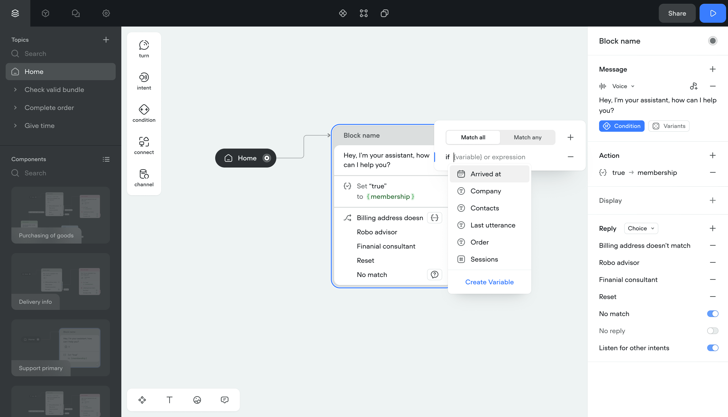
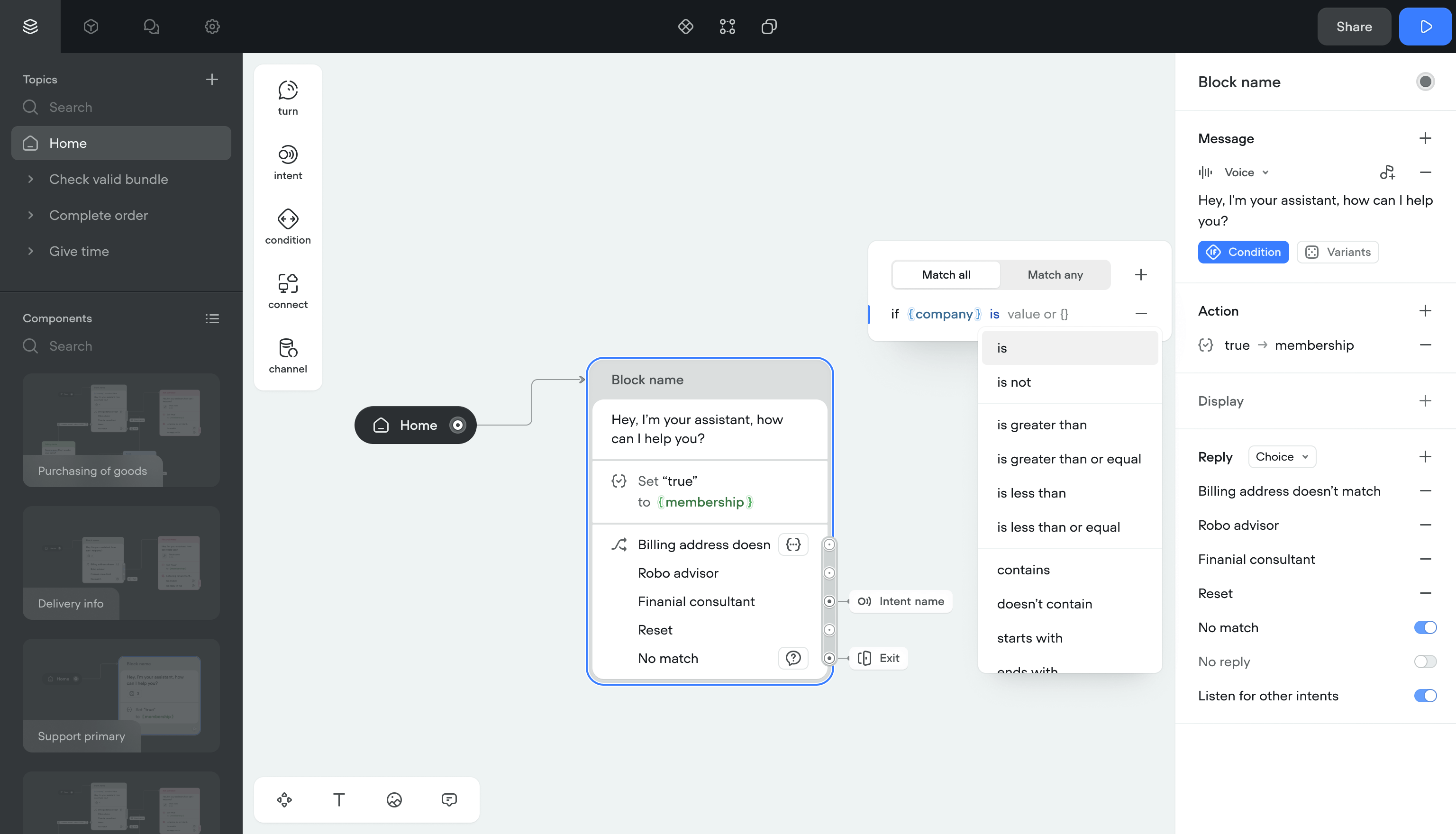
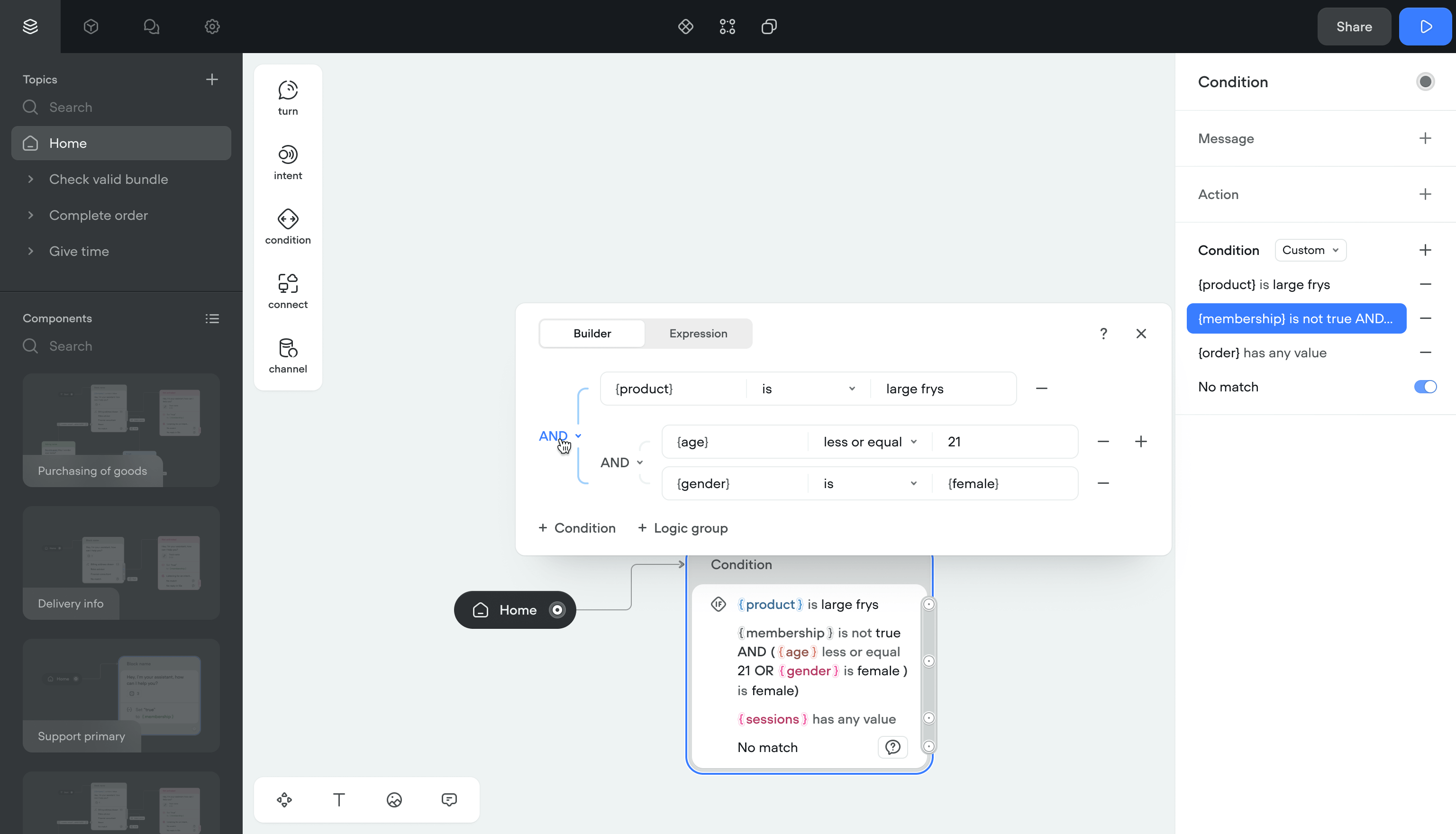
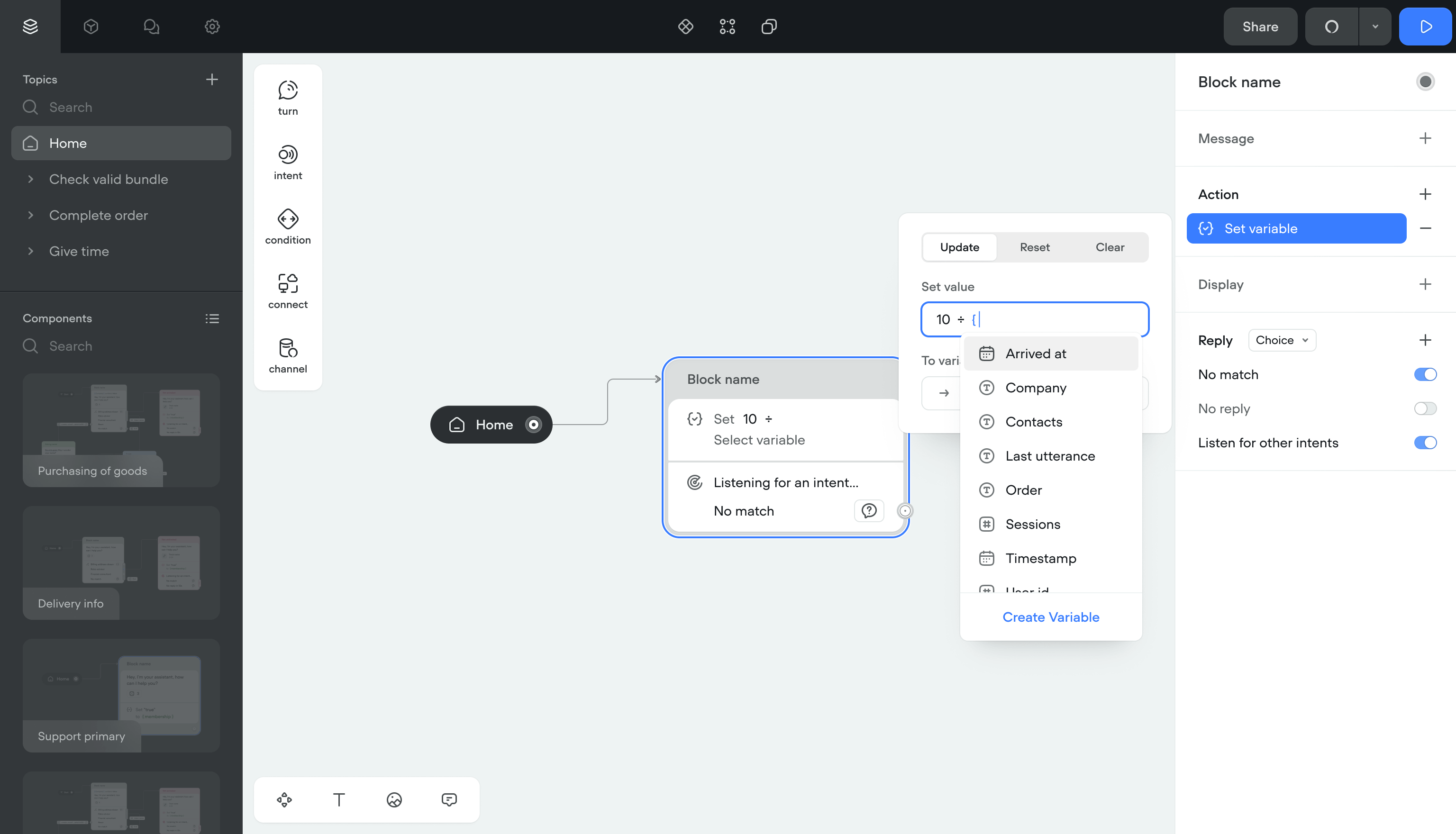
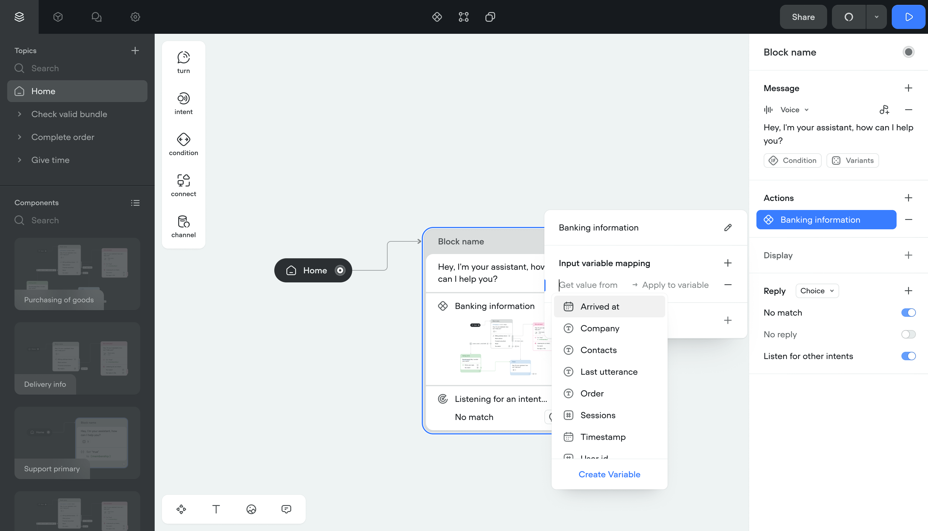
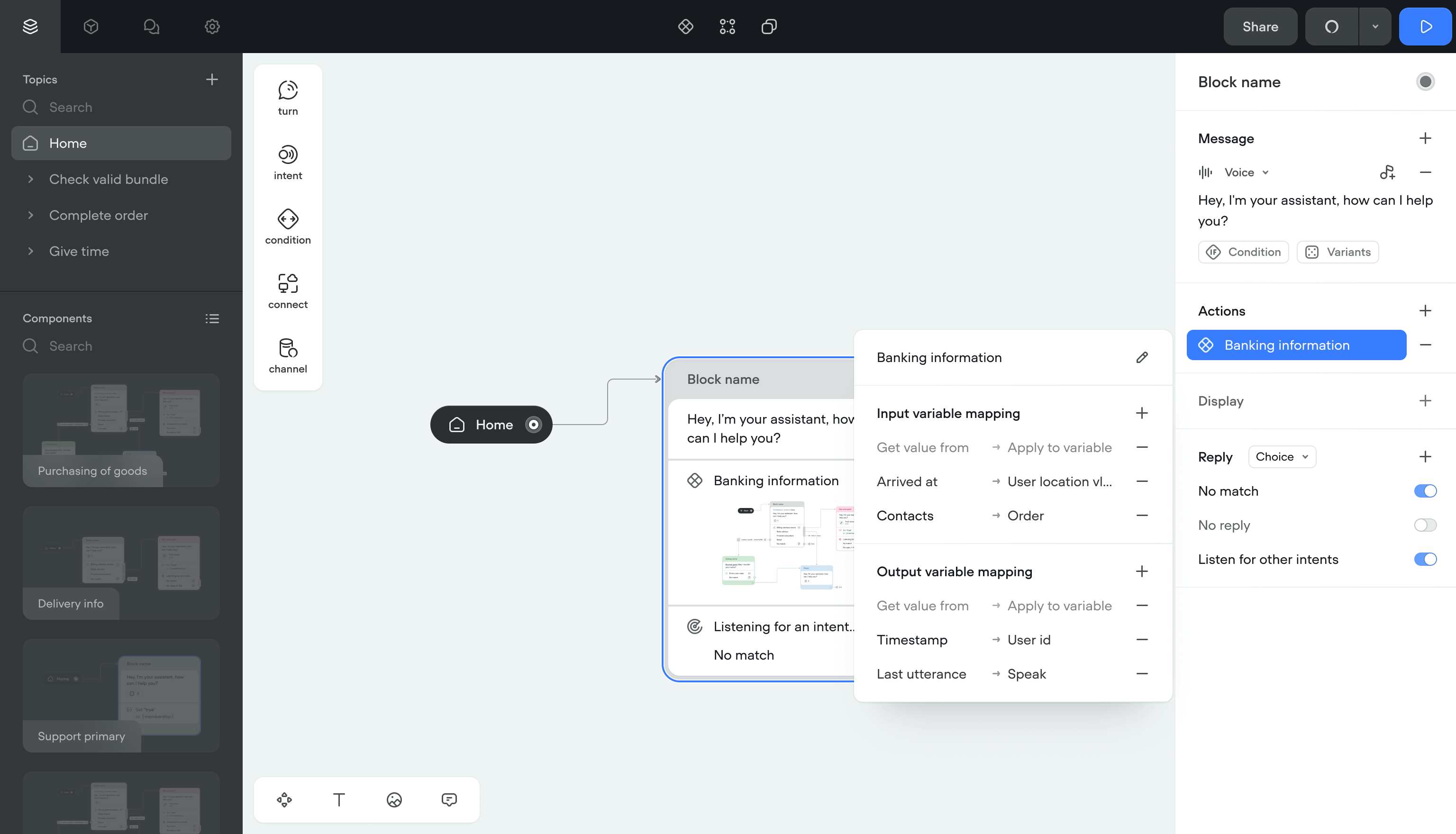
Variables and conditions
Showing different messages based on conditions required a separate branch for each outcome. Complex projects filled the canvas with branches, and some laptops ran out of memory.
SolutionI moved conditions inside message steps.
- Inline conditions cut the number of canvas items
- Fixed memory issues on lower-spec machines
- Added a dedicated condition builder for complex logic
- Auto-complete for variables with access to the shared library
- Inline editing so variables can be changed without leaving the step
Simpler canvases, fewer clicks, and teams could build complex branching without the canvas becoming unreadable.

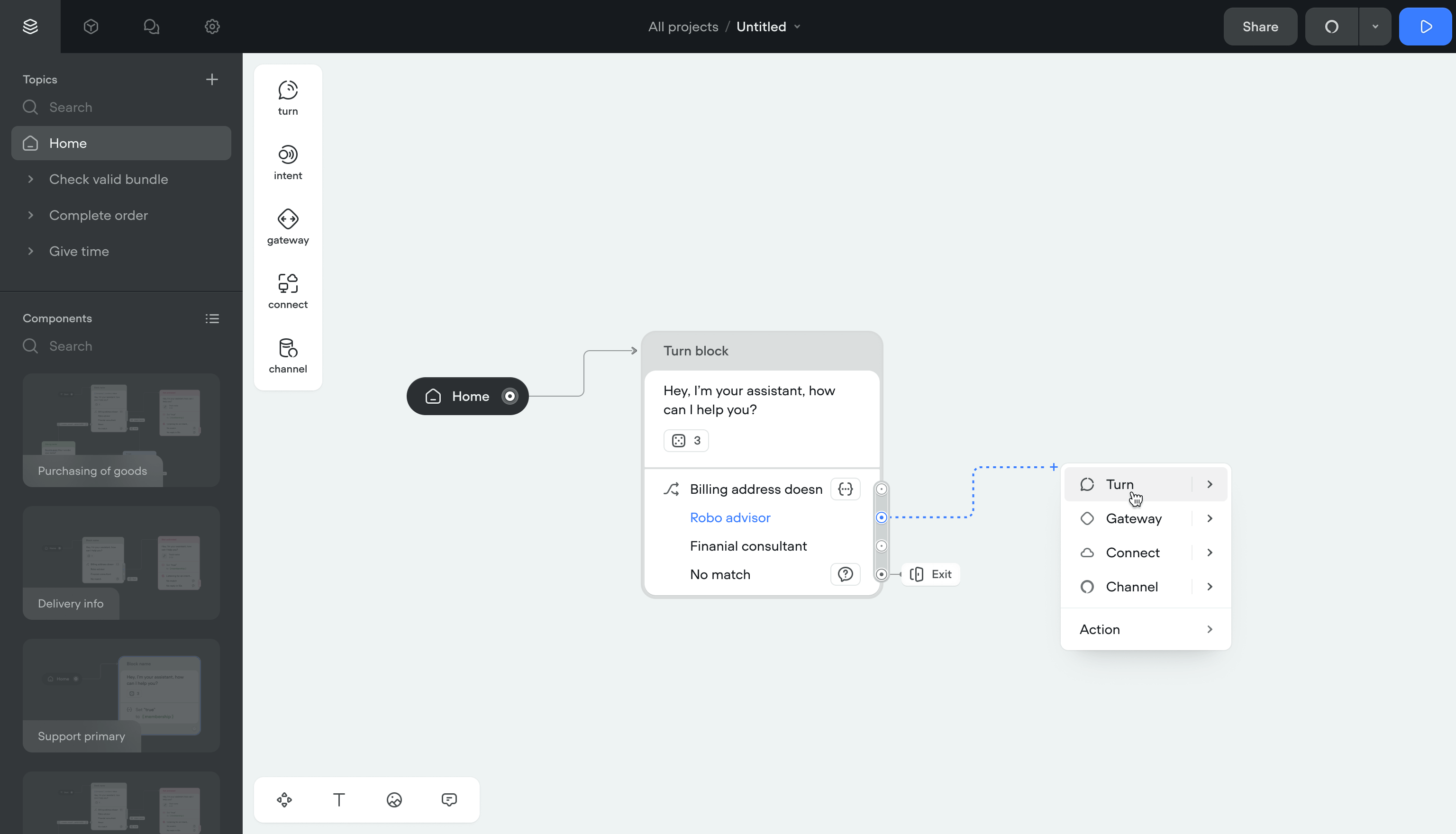
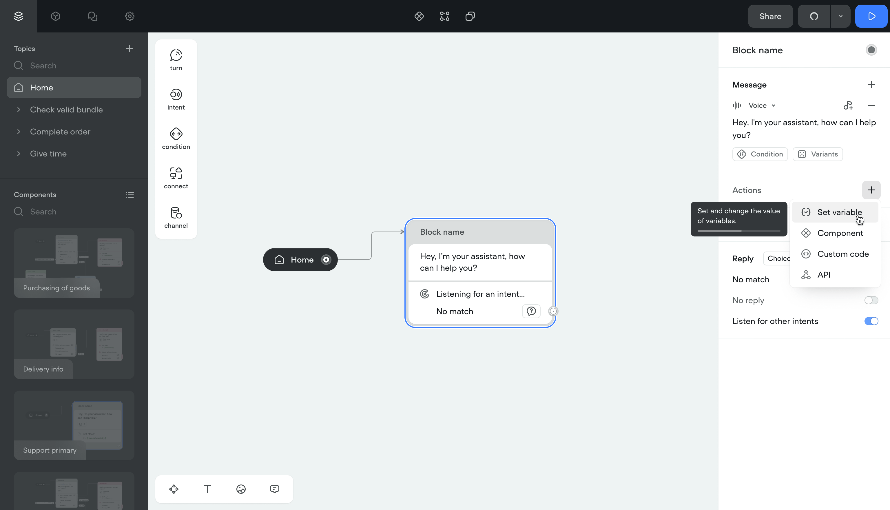
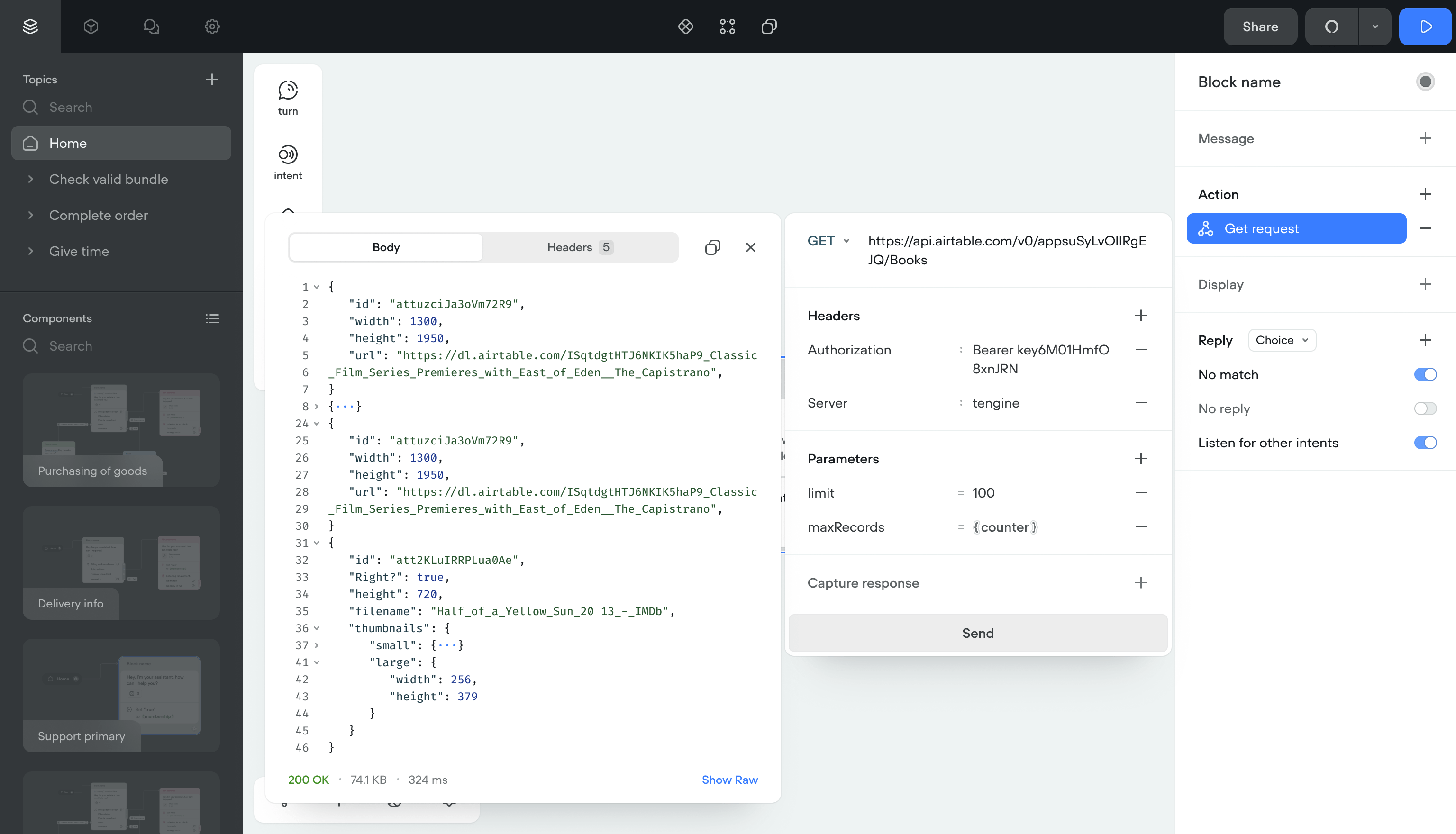
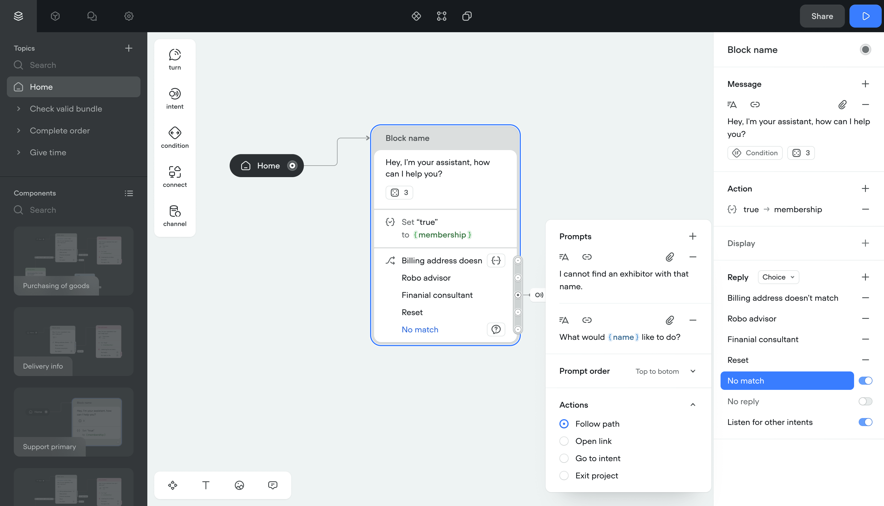
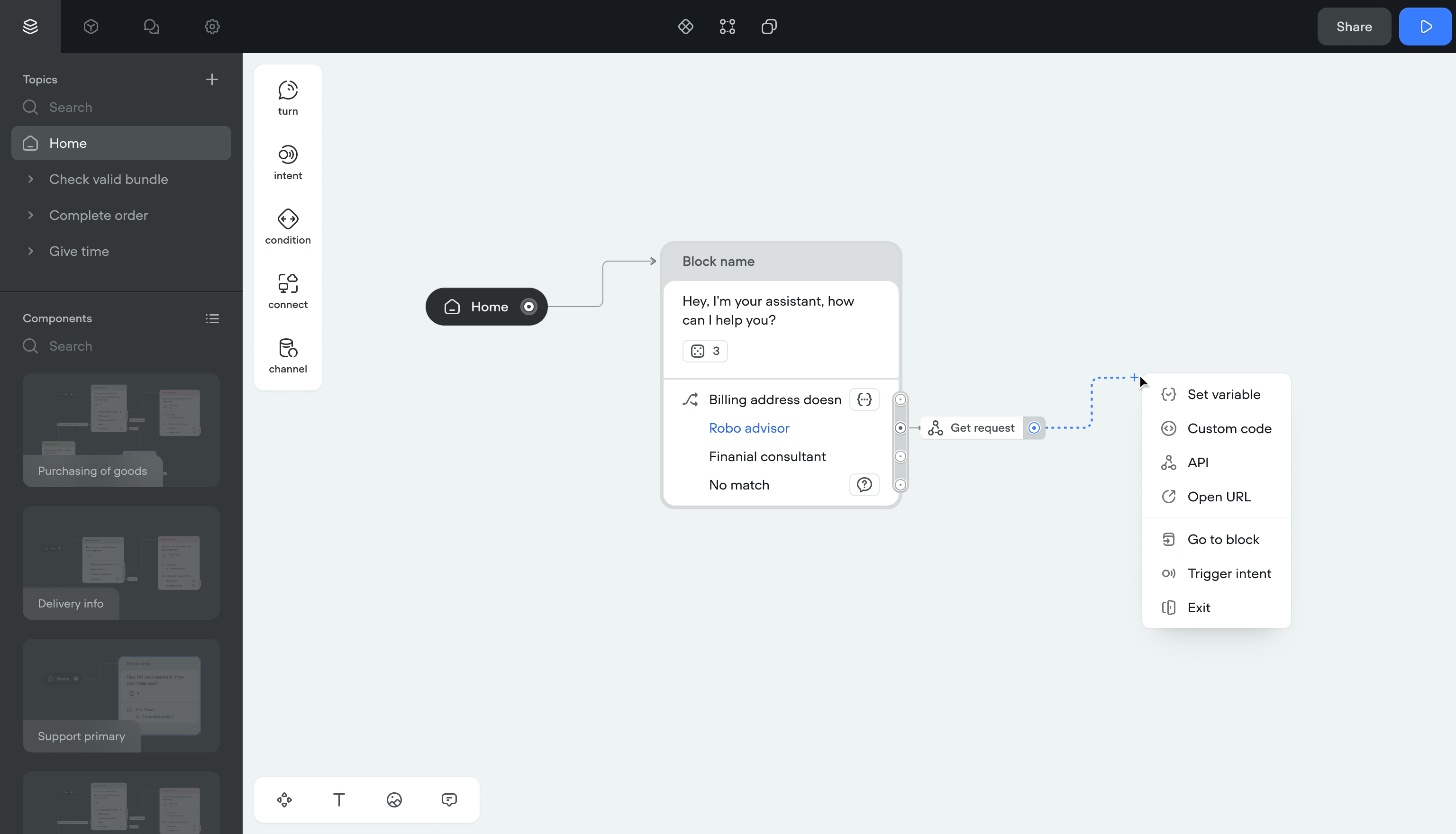
Actions
Actions (set a variable, run JS, call an API) were separate blocks on the canvas. Every action added clutter and made flows harder to follow.
SolutionI moved actions inside existing blocks. No more separate action items on the canvas.
I also built Components: reusable logic units. A flow can jump to a Component, run its logic, and return with updated data. This made non-linear conversations possible without duplicating blocks.
ImpactCreators could build context-aware flows that branch and return. The canvas stayed clean even for complex projects.
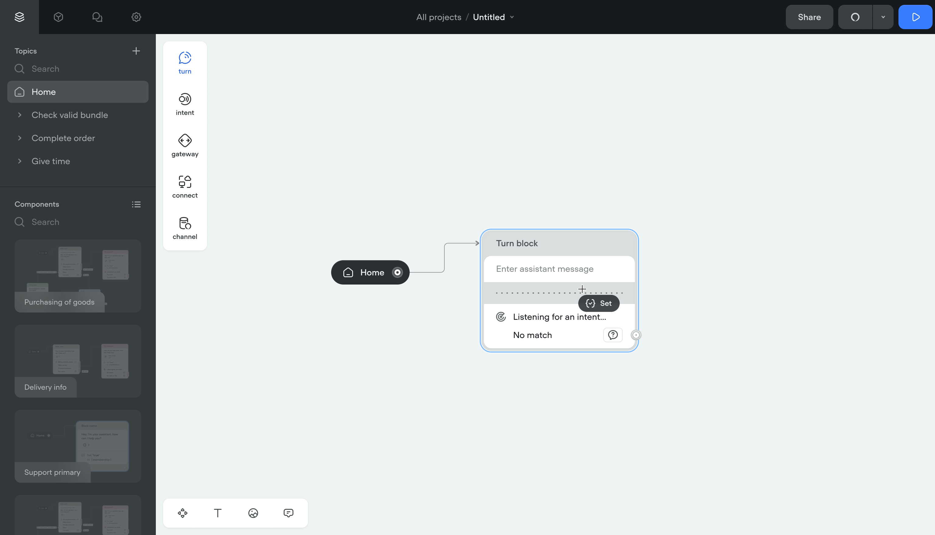
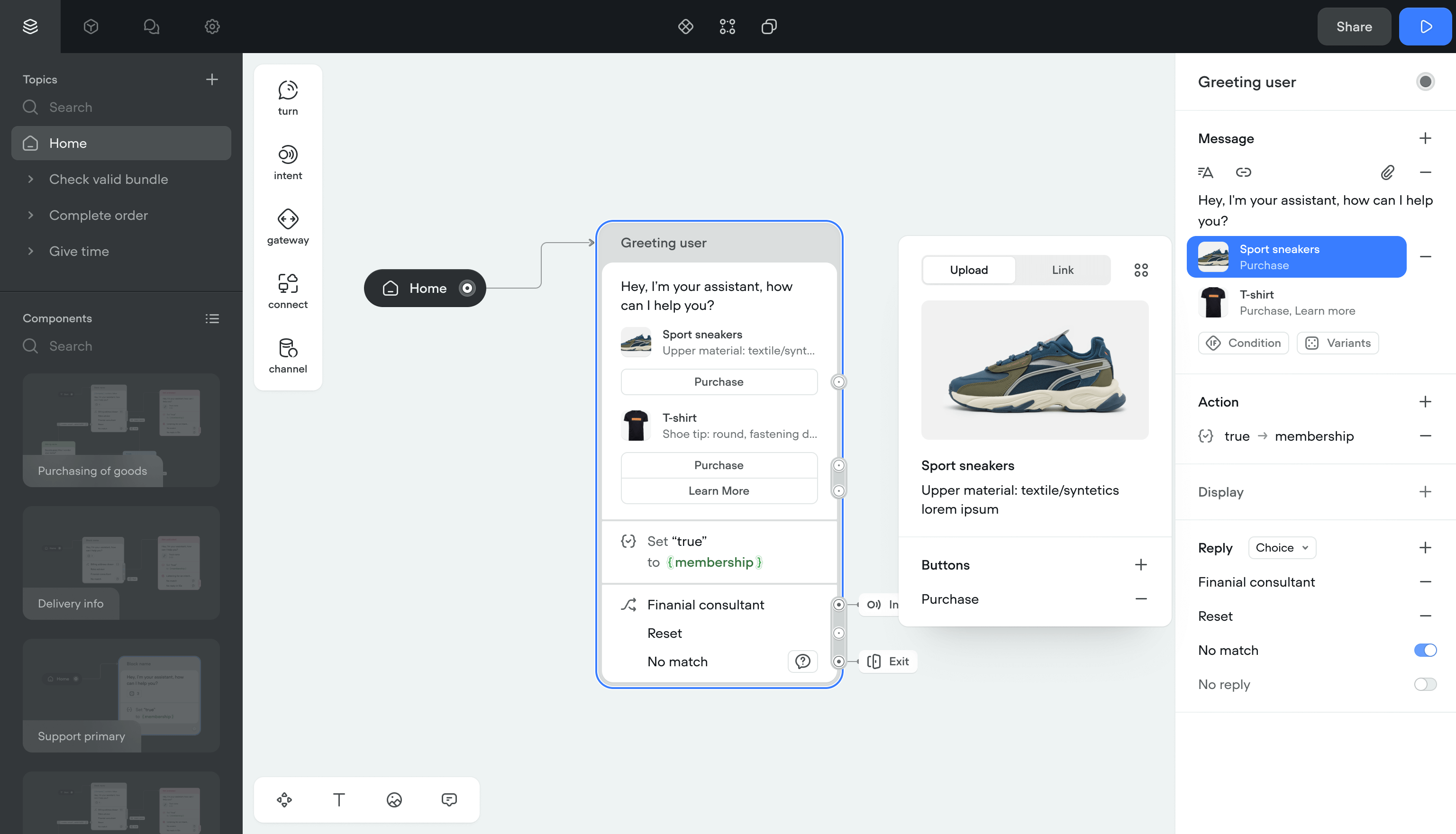
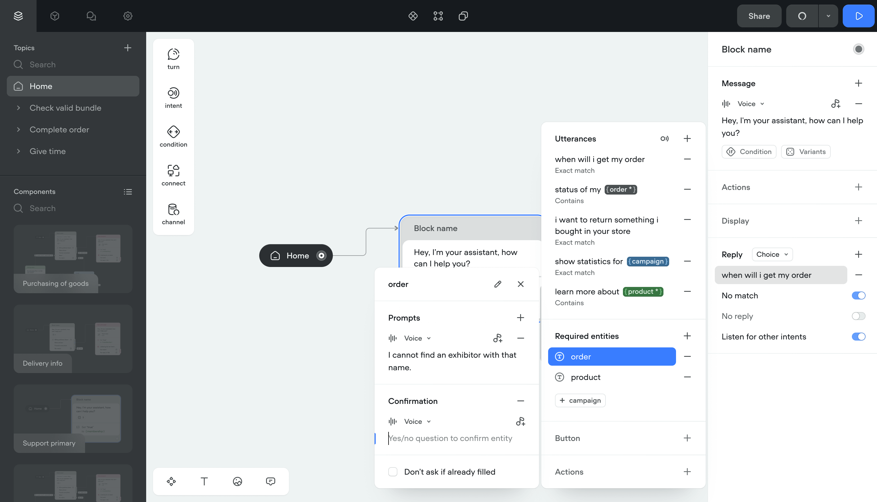
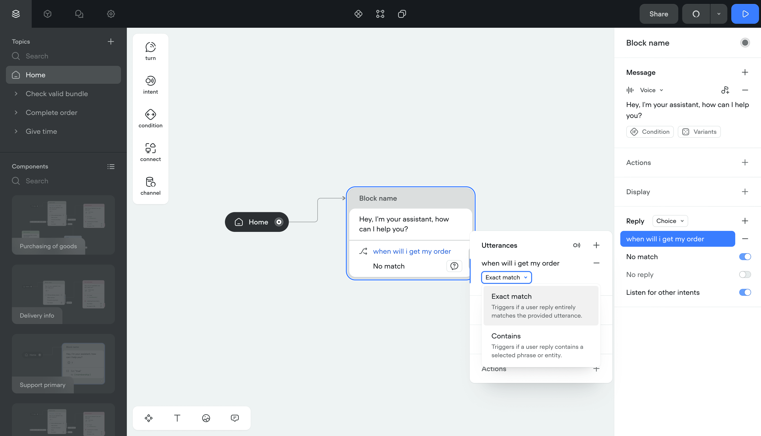
User input
User replies were limited to a predefined list at each step. The conversation followed one fixed path. Creators needed separate canvas items for background actions like setting variables or running code.
Solution- Input capturing — Pulls data from replies into variables. If something's missing, the bot asks follow-up questions automatically.
- Listening mode — The bot picks up intents outside the current block. Users can switch flows mid-conversation and come back.
- Automatic actions — Setting variables, opening links, running code now happens inside the reply step. No extra canvas items.
Users stopped hitting dead ends. Creators stopped managing dozens of extra blocks for simple actions.
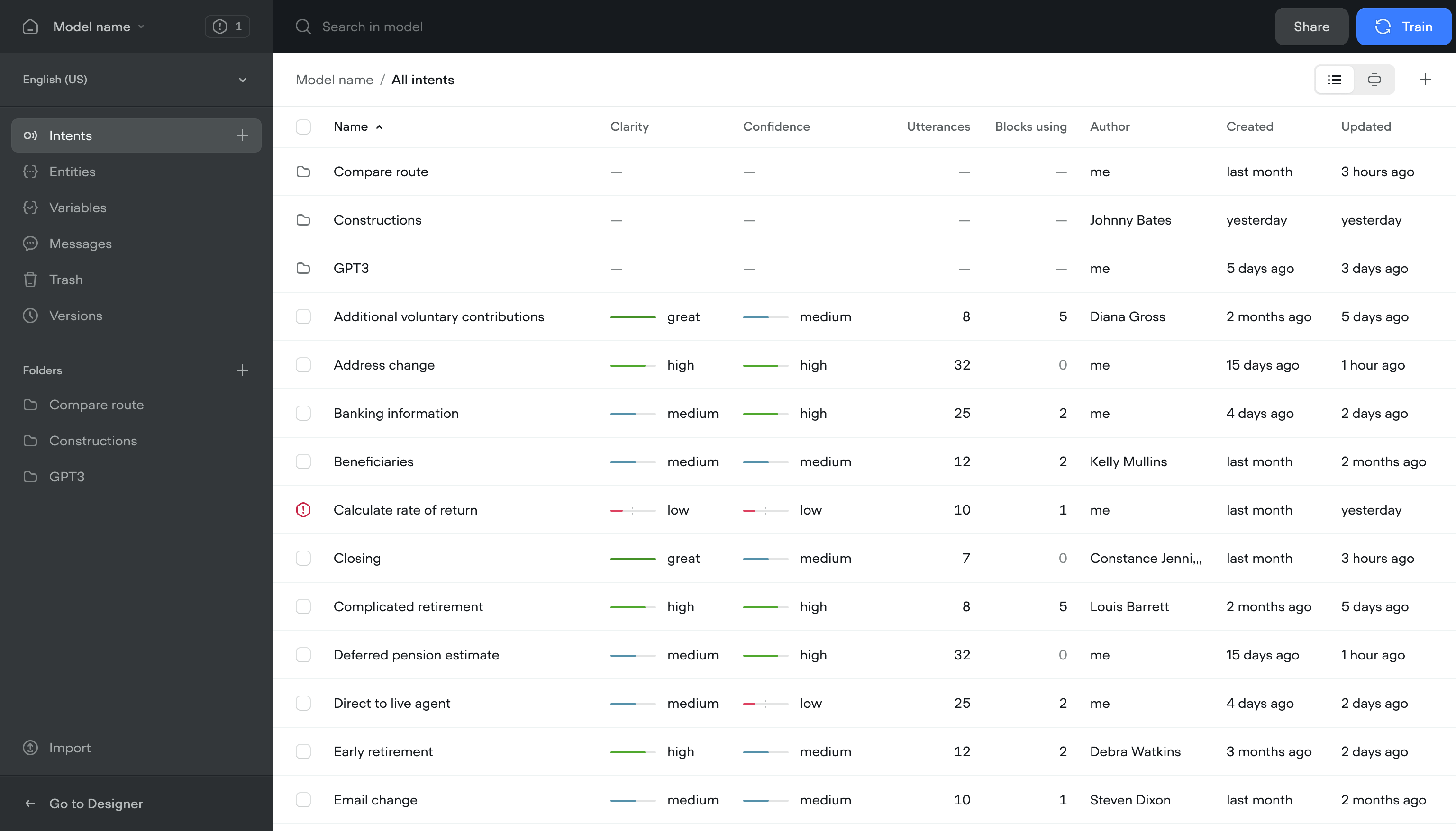
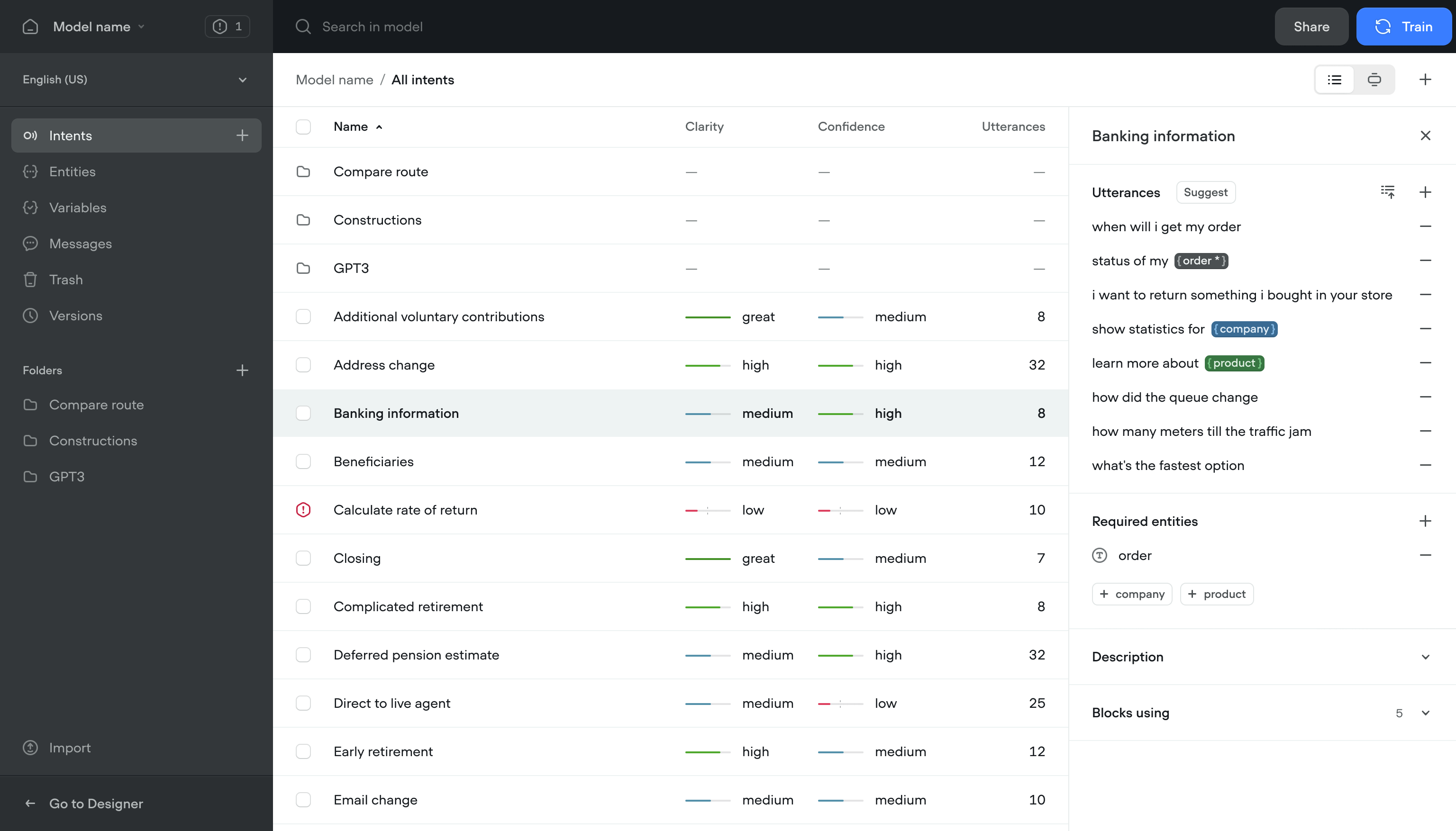
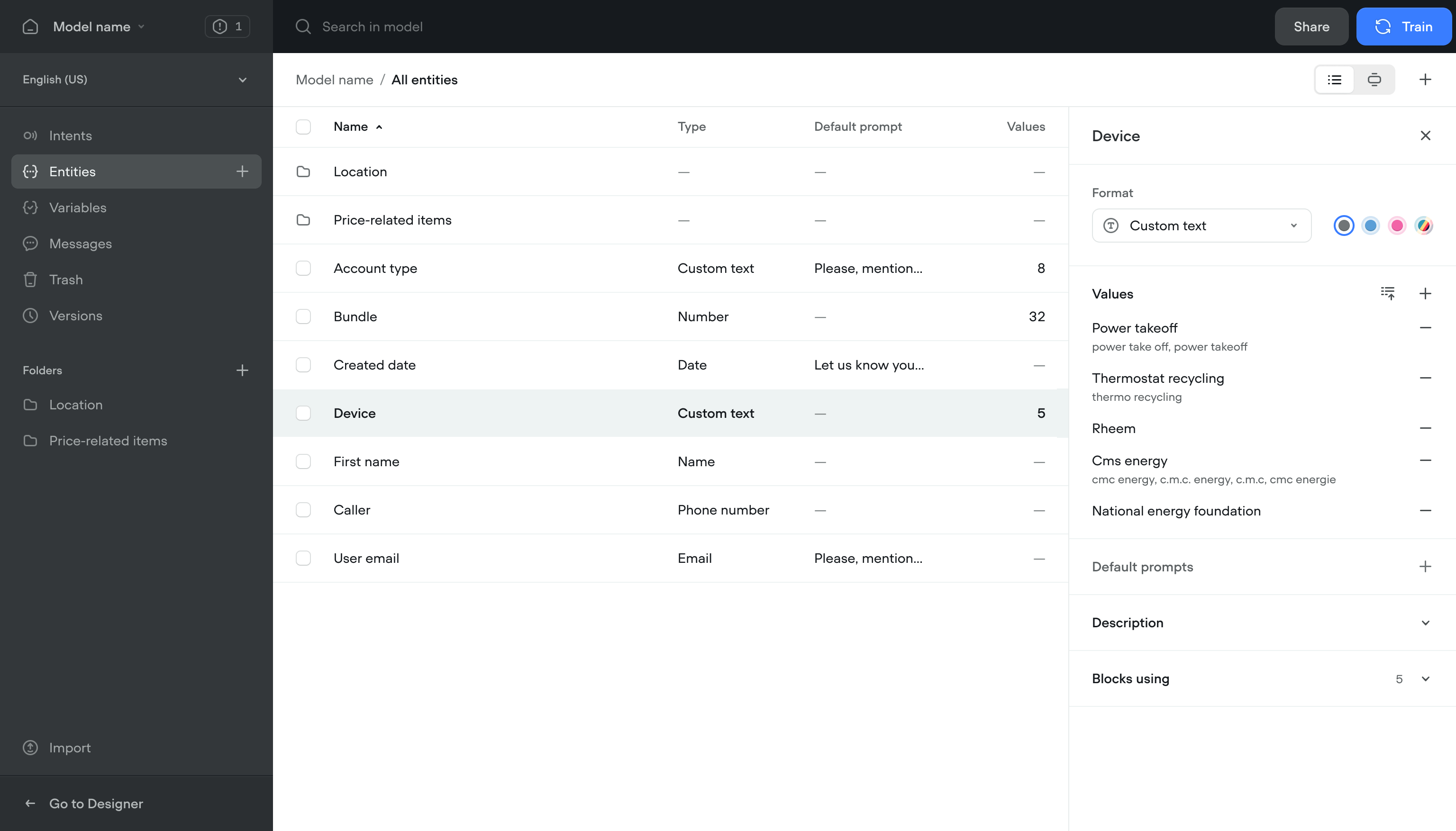
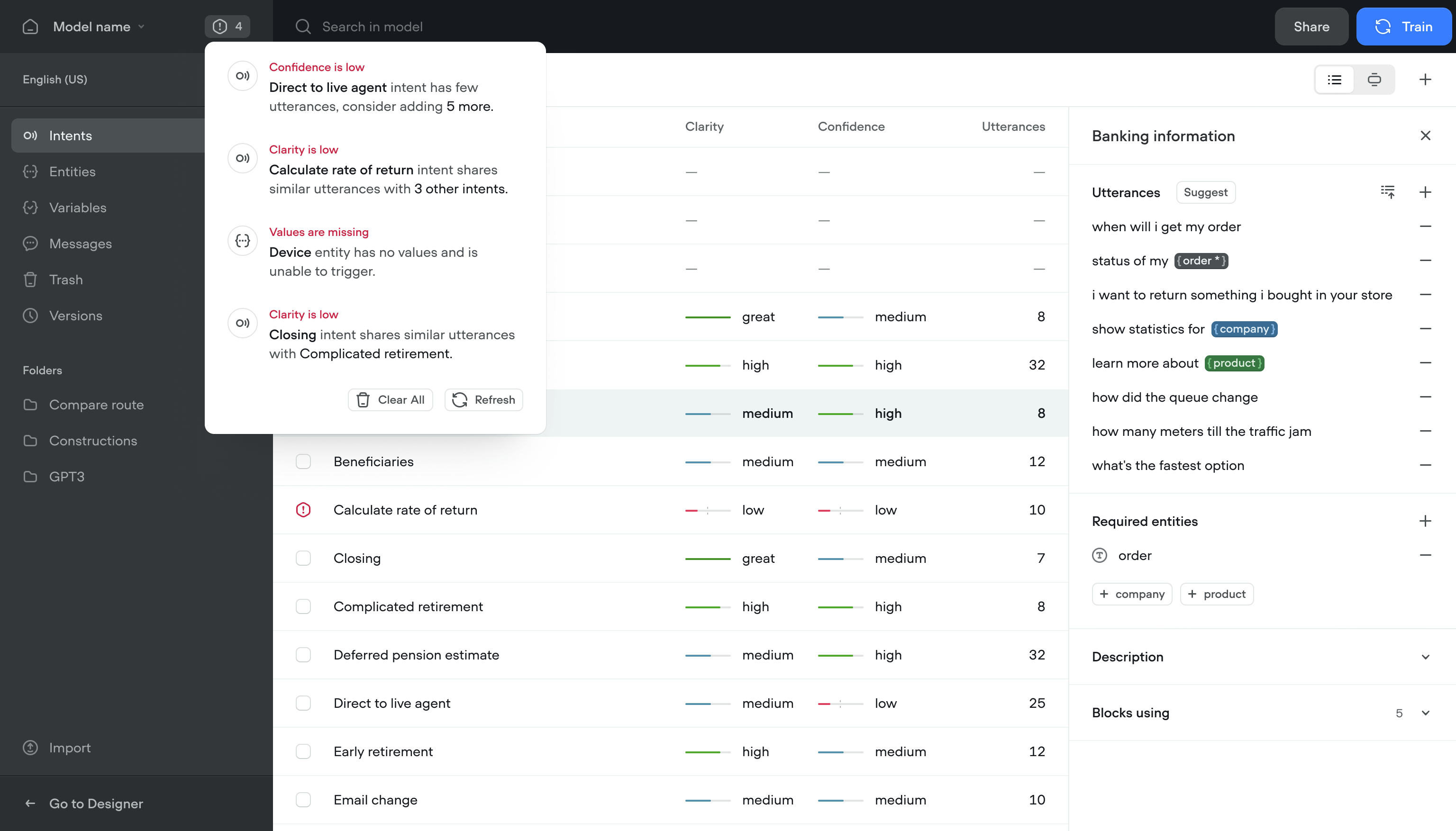
Centralized model management
Content managers, designers, and engineers all needed to work in the same project. People who used the app less often couldn't find what they needed without digging through the full canvas.
Solution- Content view — Find and edit content without opening the canvas
- Conflict resolution — See and fix script conflicts across the team
- Model training — Train and refine the conversational model without writing code
- Notifications — Flags issues with the model and suggests fixes
Team members who used to avoid the app started using it. Content updates that took 20 minutes now took 3.
Outcome
The redesign shipped and kept working long after I left.
More team members across roles started using the platform daily. Retention went up with it.
The architecture held. Performance stayed consistent as usage grew.
Teams built and shipped conversational flows in less than half the time.
The updated product helped close a new round and brought in enterprise accounts.
Let's see if it's a fit.