 2019 – 2021
Chattermill turns customer feedback into structured analytics. Text, audio, video reviews go in. NLP categorizes them. Charts and dashboards come out. I joined as the first designer to redesign the whole platform.
Focus
The existing app was built fast. It worked, but usability, visuals, and core flows all needed rethinking.
I started by collecting pain points and feedback, then designed an approach where old features could coexist with new ones during the rollout. The visual quality mattered too. In enterprise analytics, most competitors look the same. A polished interface was a real differentiator in demos.
Interface scalability
Reusable components, design system, guidelines.
Aesthetics & accessibility
Modern UI with accessible color palettes for data visualization.
Self-serve onboarding
Step-by-step integration setup and data source connection.
Flexible reporting
Custom dashboards, report builder, and workflow automation.
Scope
"Redesign" is vague. I broke it into stages, each with specific steps, so the team could see what was happening and when.
Observation
- Watching user sessions
- Working in the support
- Structuring complaints and requests
- Analyzing competitors
Testing & improvement
- Watching user sessions
- Collecting feedback
- Mechanics improvements and visual restyling
Implementation
- Designing high-level UI concepts
- Layout and basic elements design
- Functional components and interactions
- Corner cases
- Assembling design system
- Writing specifications
Hypothesis validation
- Quick surveys
- Event tracking
- Customer development sessions
- Determining missing backend
- Prioritization and estimation
- Defining the scope of the first versions
User research
Customer development interviews, UI feedback calls, session recordings, and every support request that came in. I read all of them.
QuantitativeUEQ surveys before and after the redesign, event tracking, and quick unmoderated surveys. I used Segment.io's visual tagger to instrument new features and piped events to Fullstory. New features had analytics from day one.
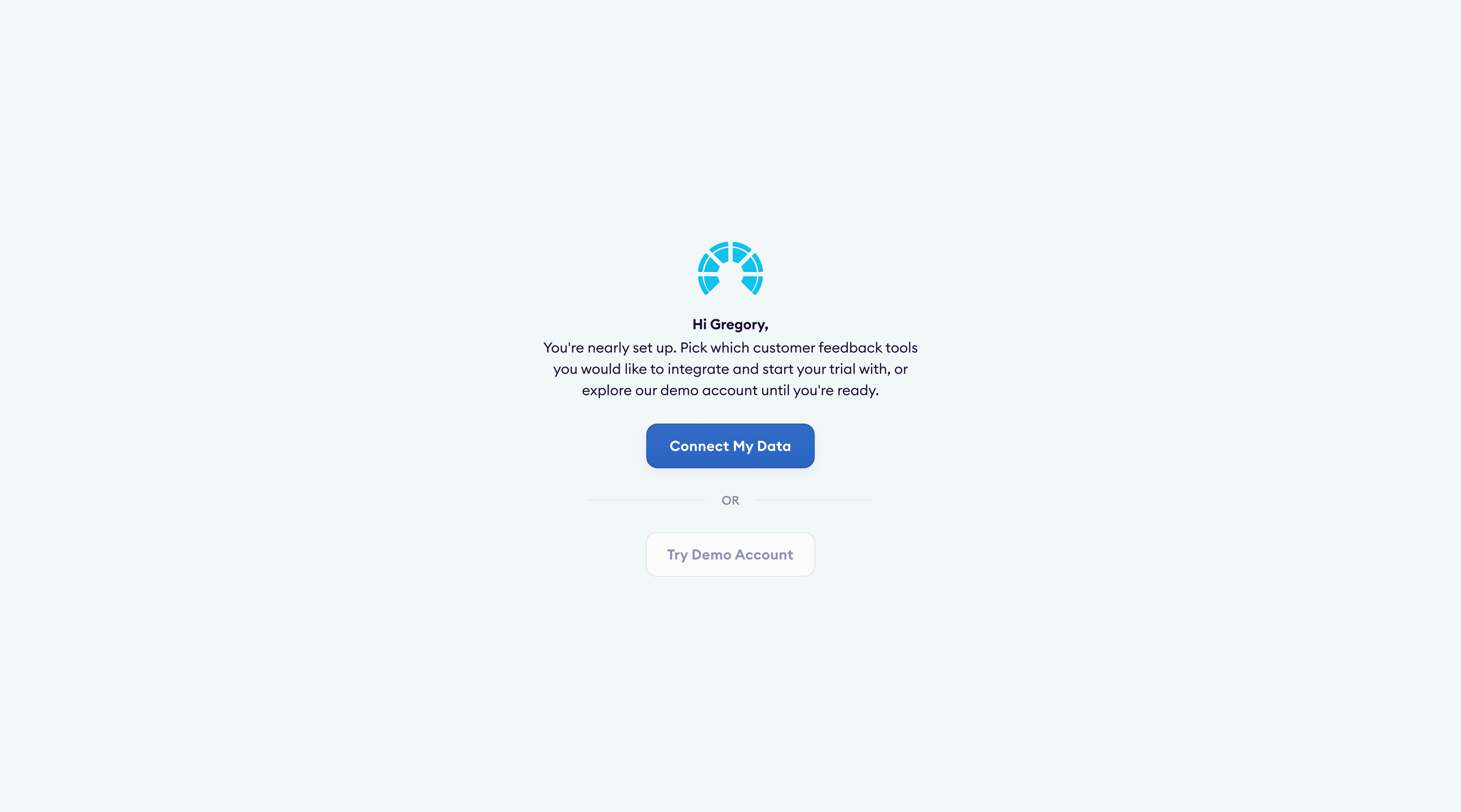
Onboarding
Every new customer needed the Chattermill team to configure the platform manually. Nobody could get started on their own.
SolutionA self-serve onboarding flow: signup, pick your integrations, connect data sources. Customers saw their first results without waiting for anyone on our side.
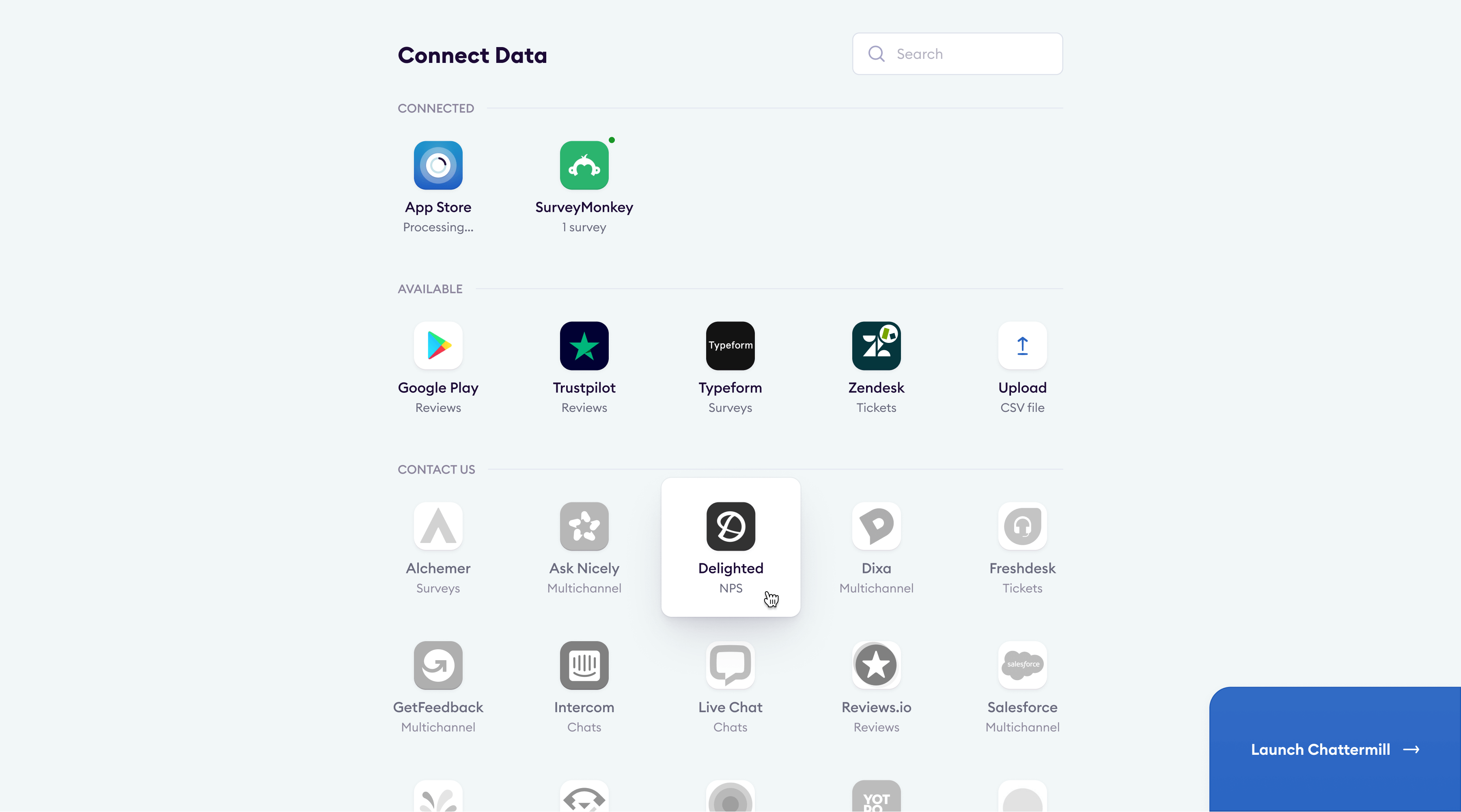
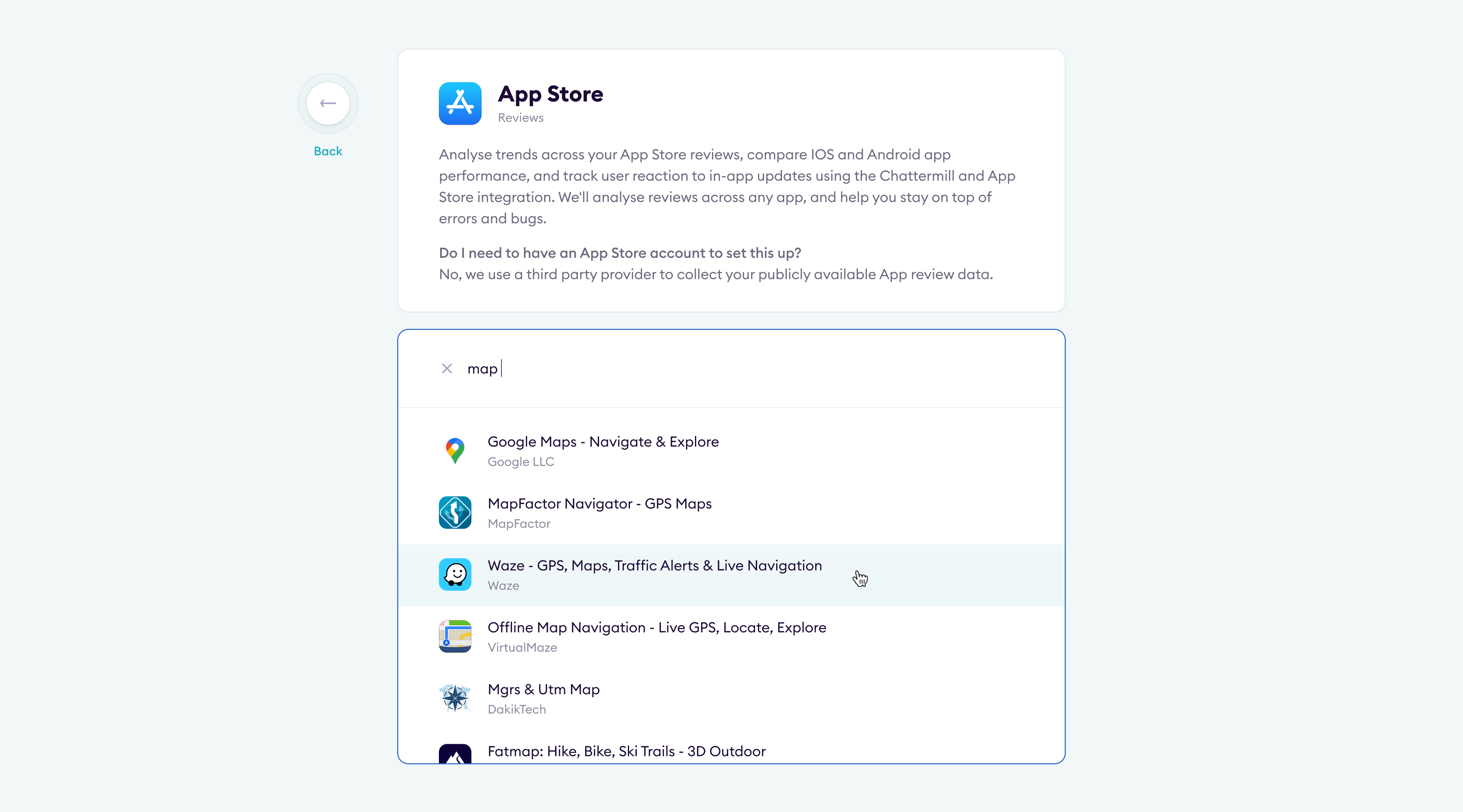
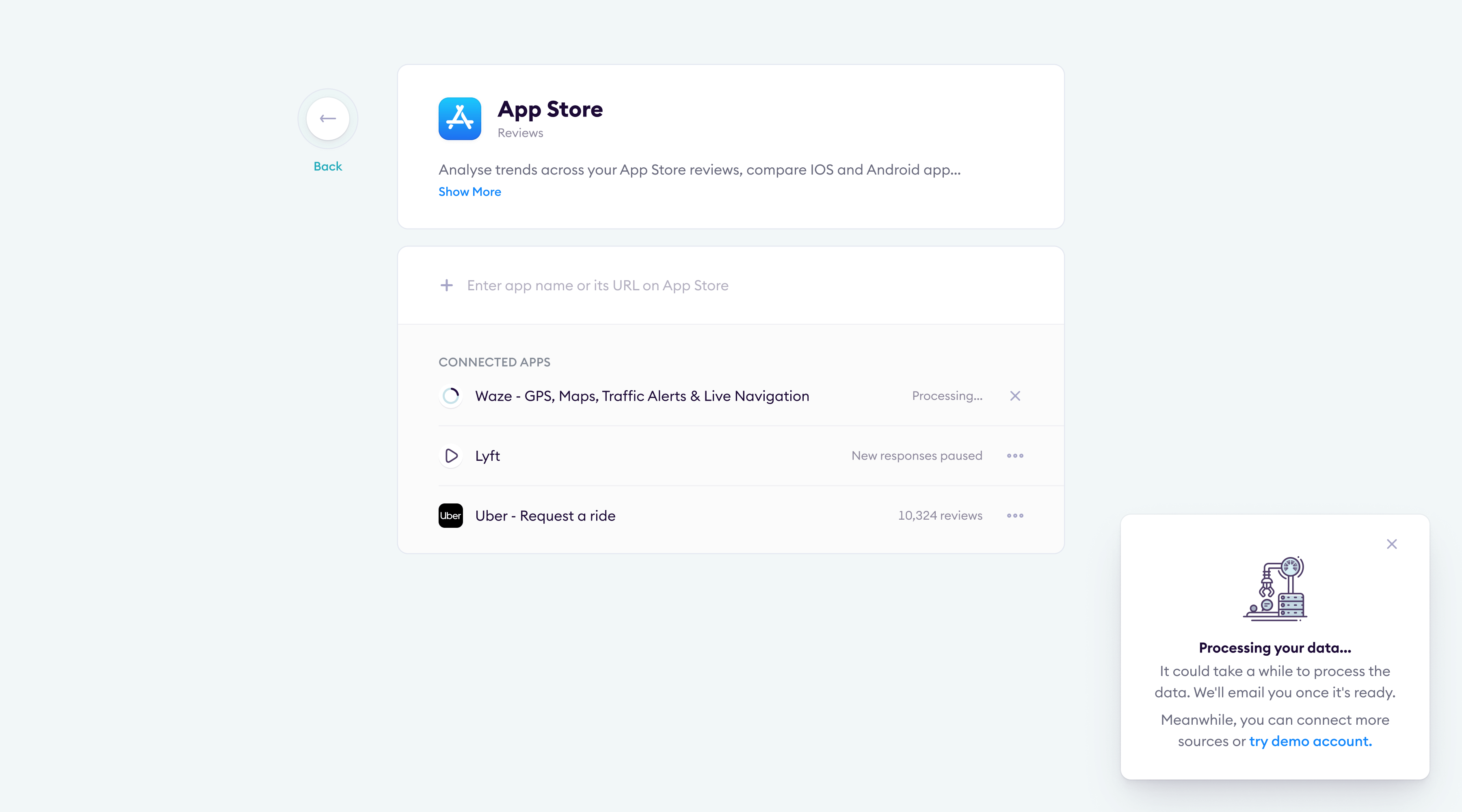
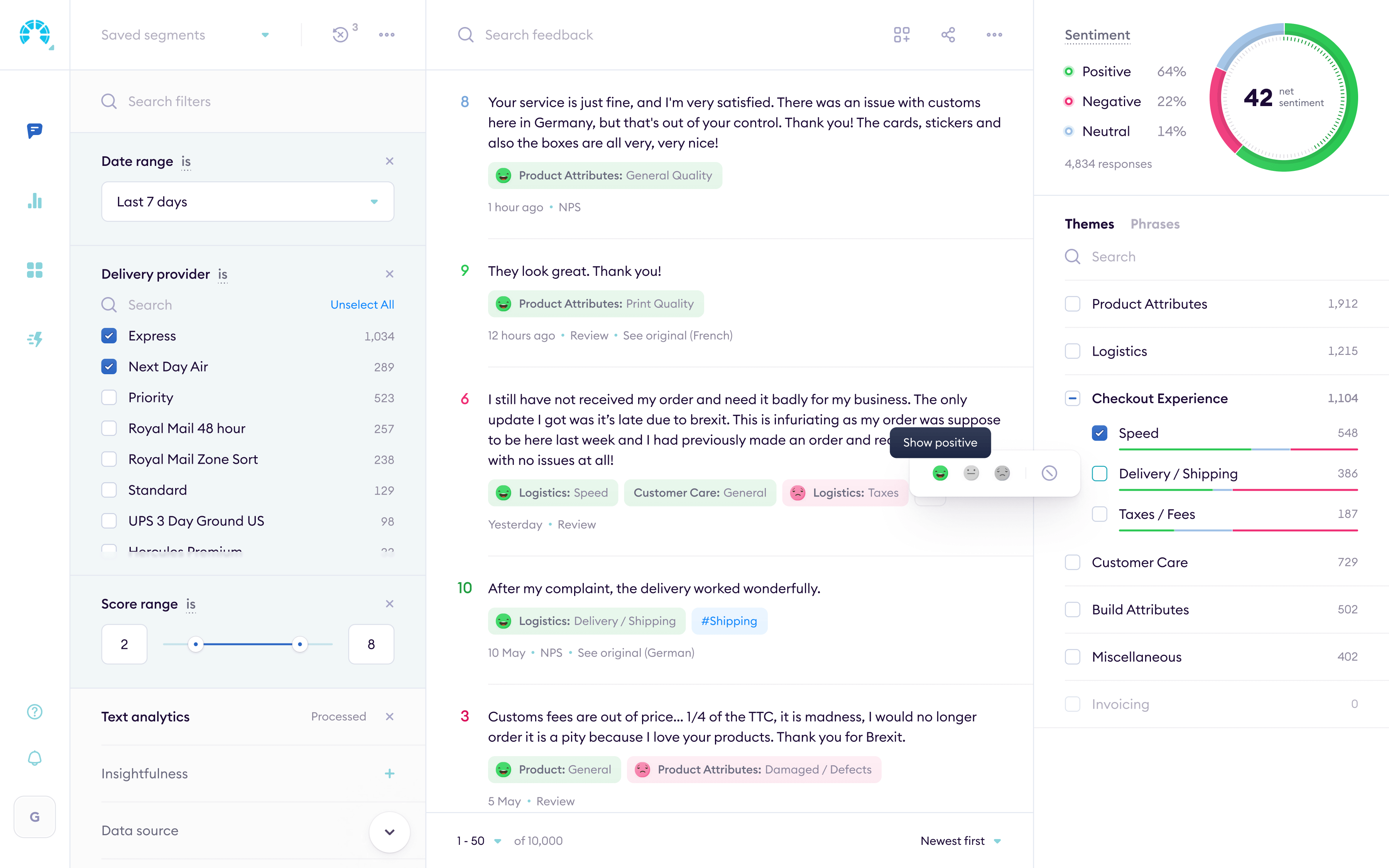
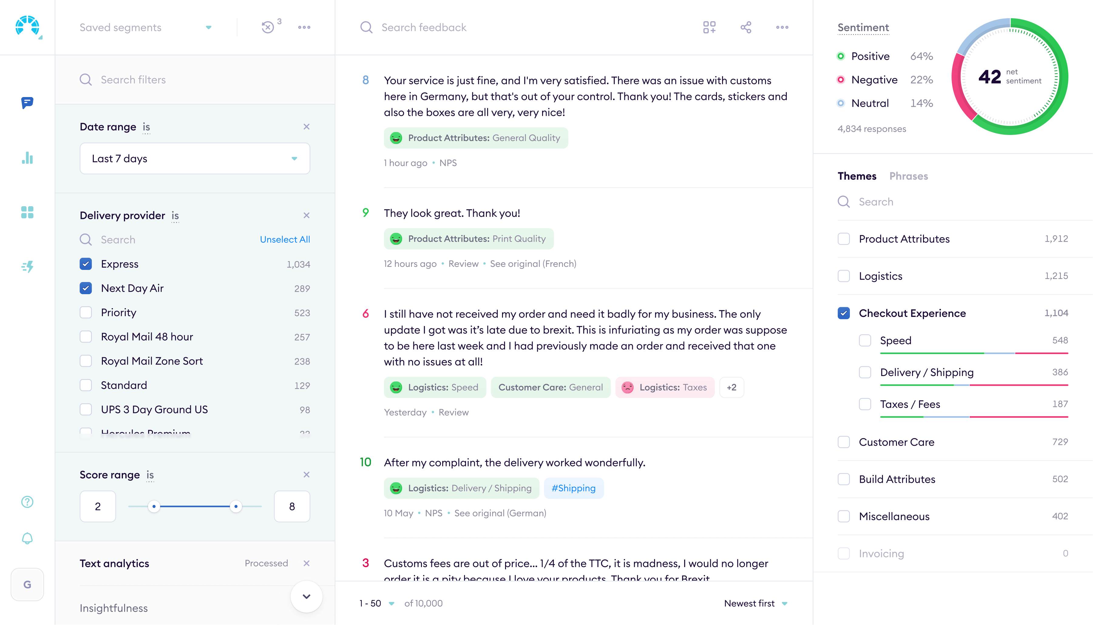
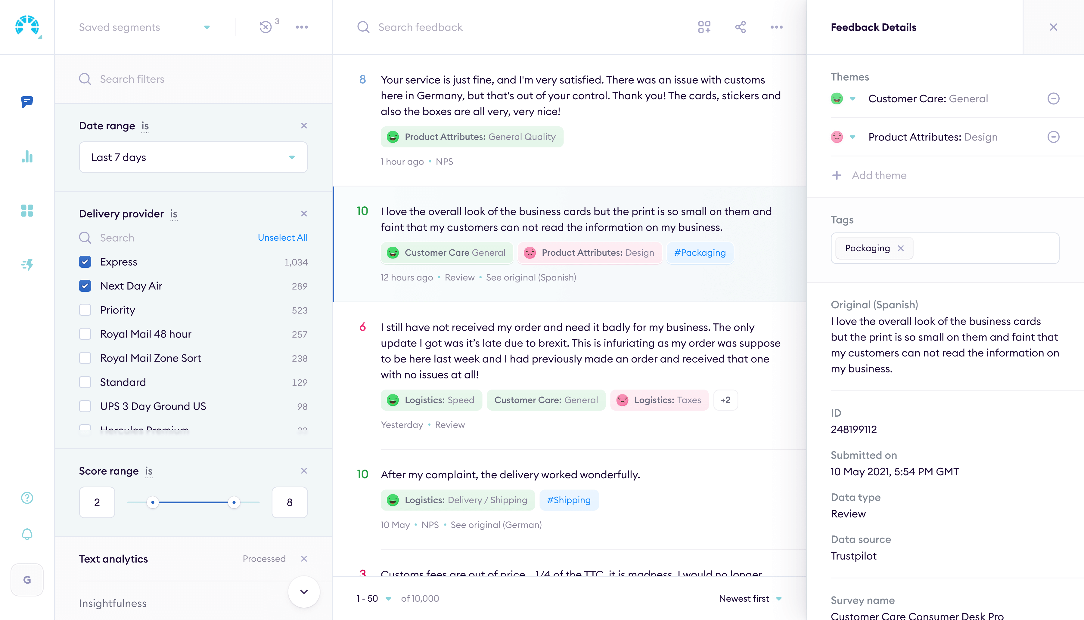
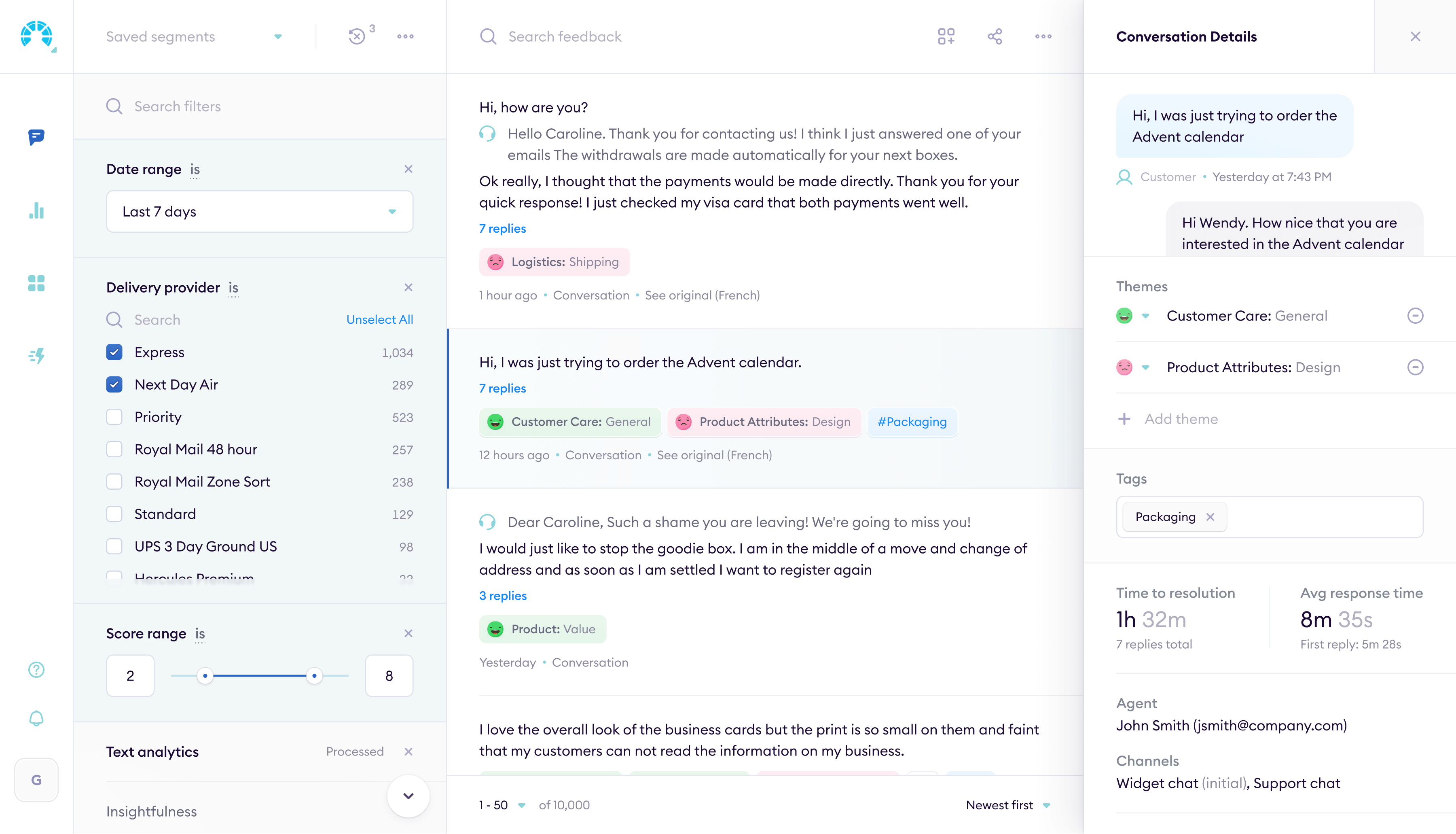
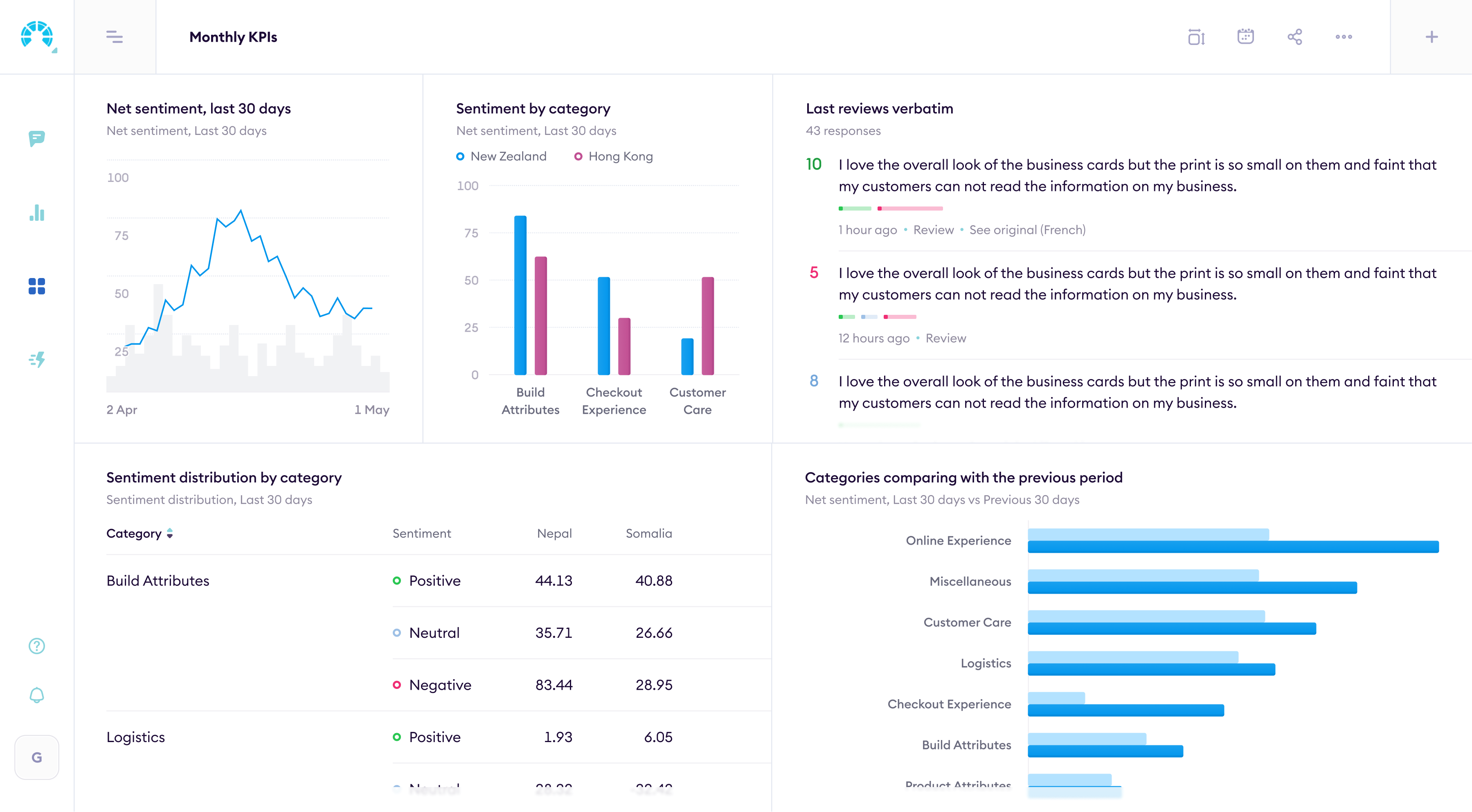
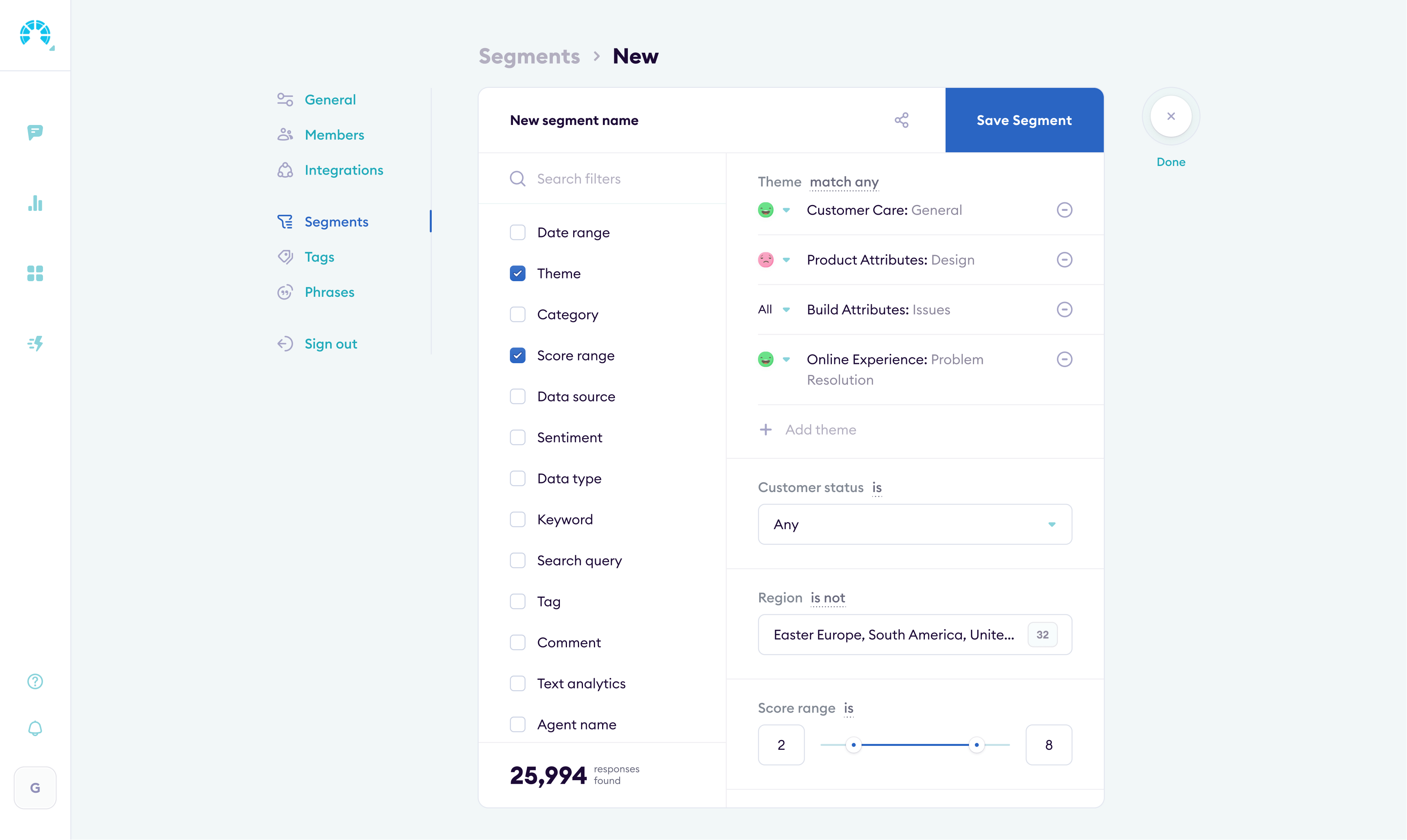
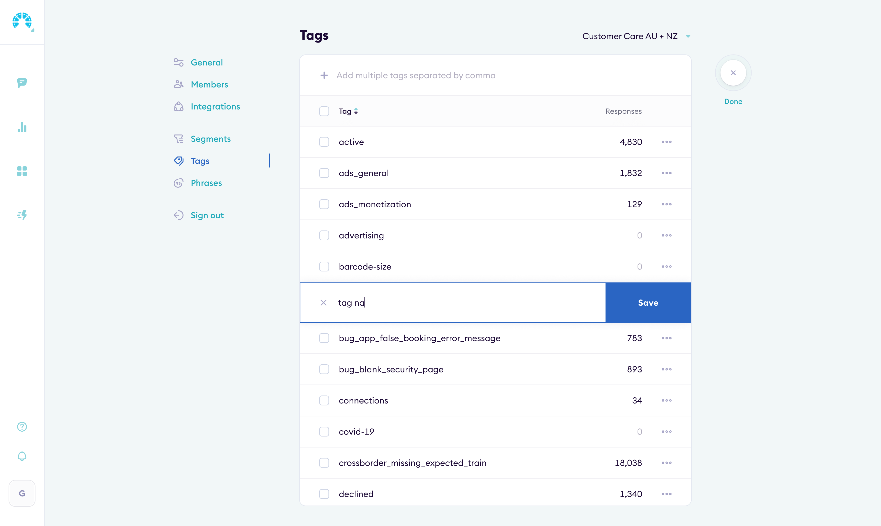
Aggregating feedback
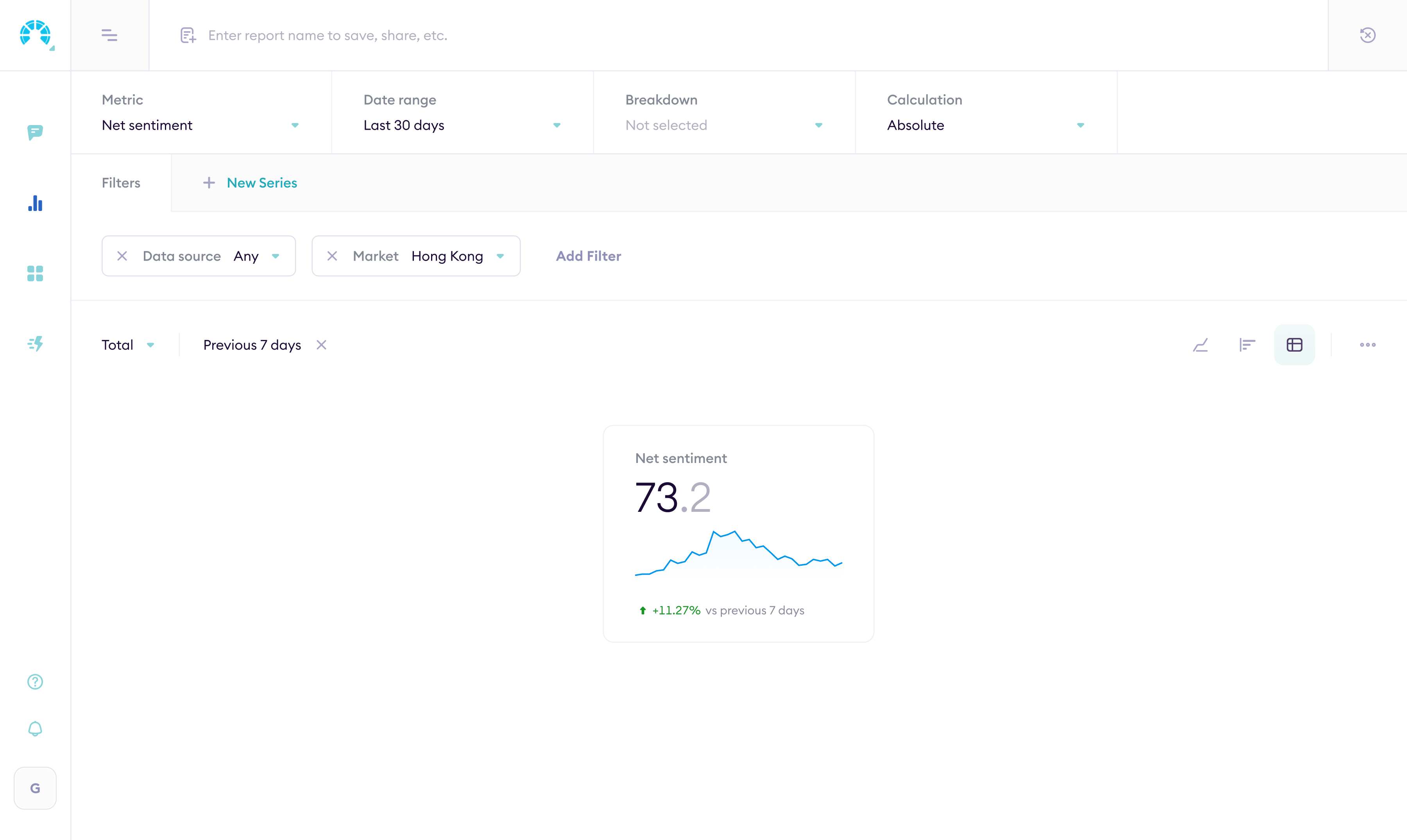
Feedback comes in from dozens of channels: surveys, app reviews, support tickets, social media. I designed the interface for pulling it all into one place, categorizing it with NLP, and showing what actually matters.
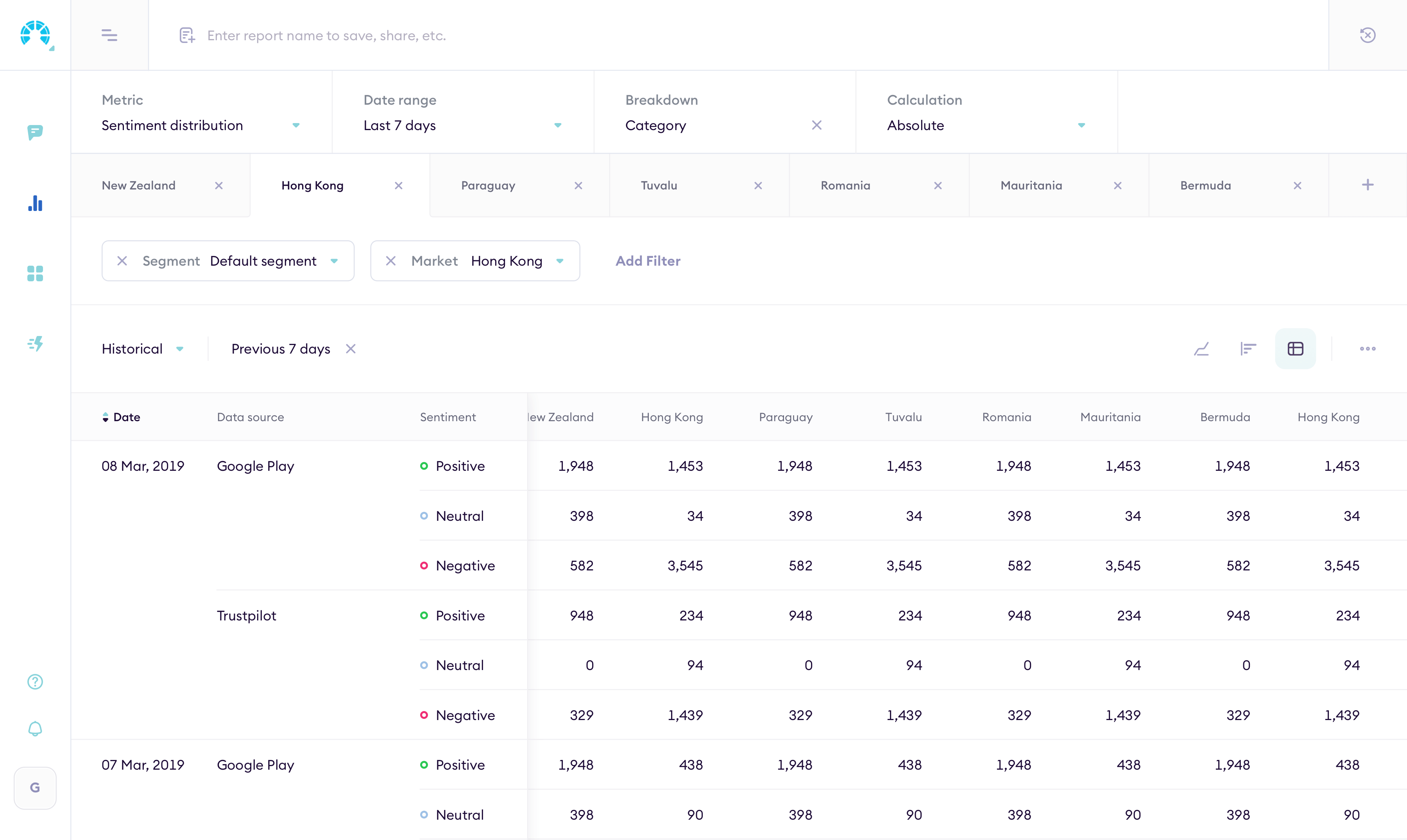
Building reports
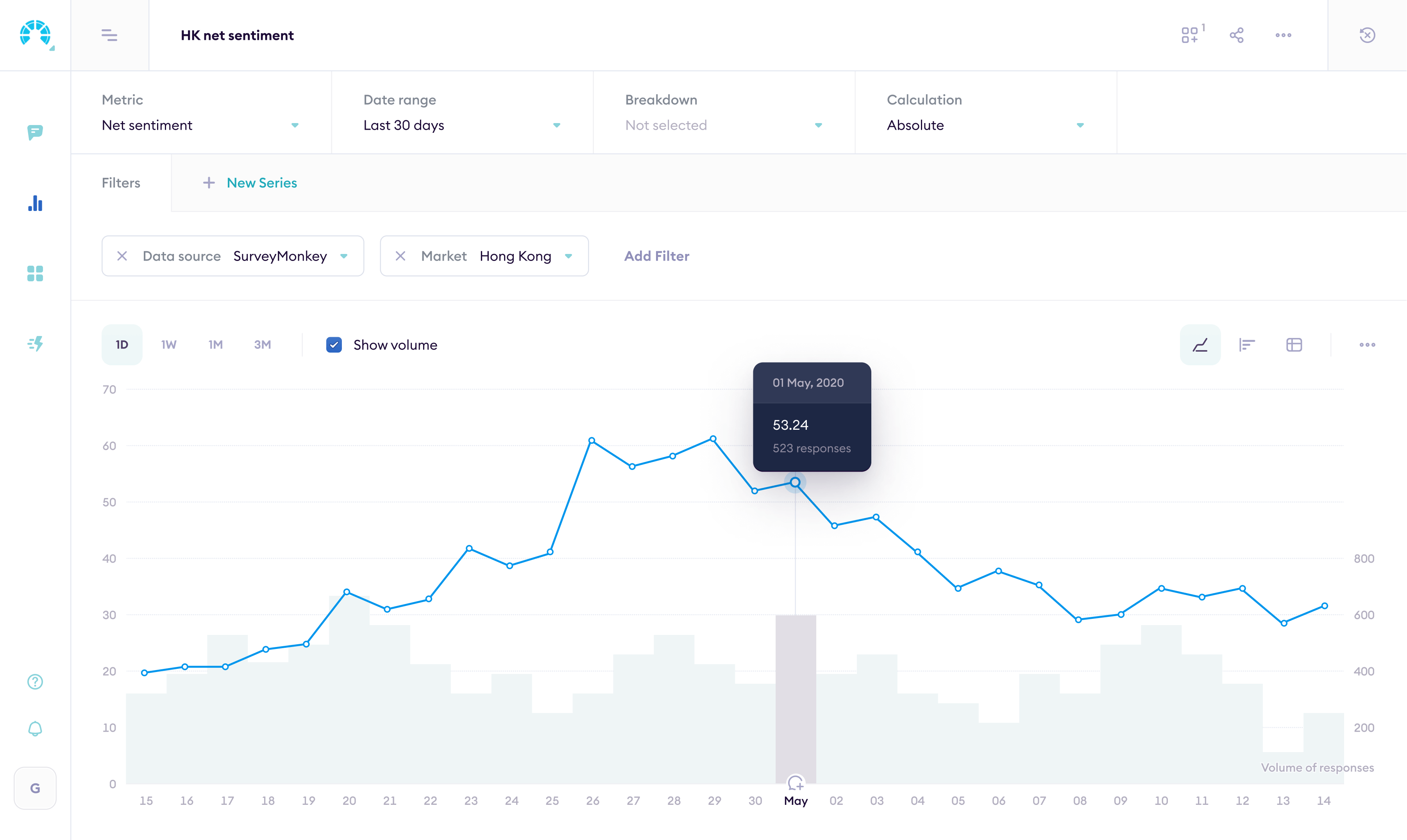
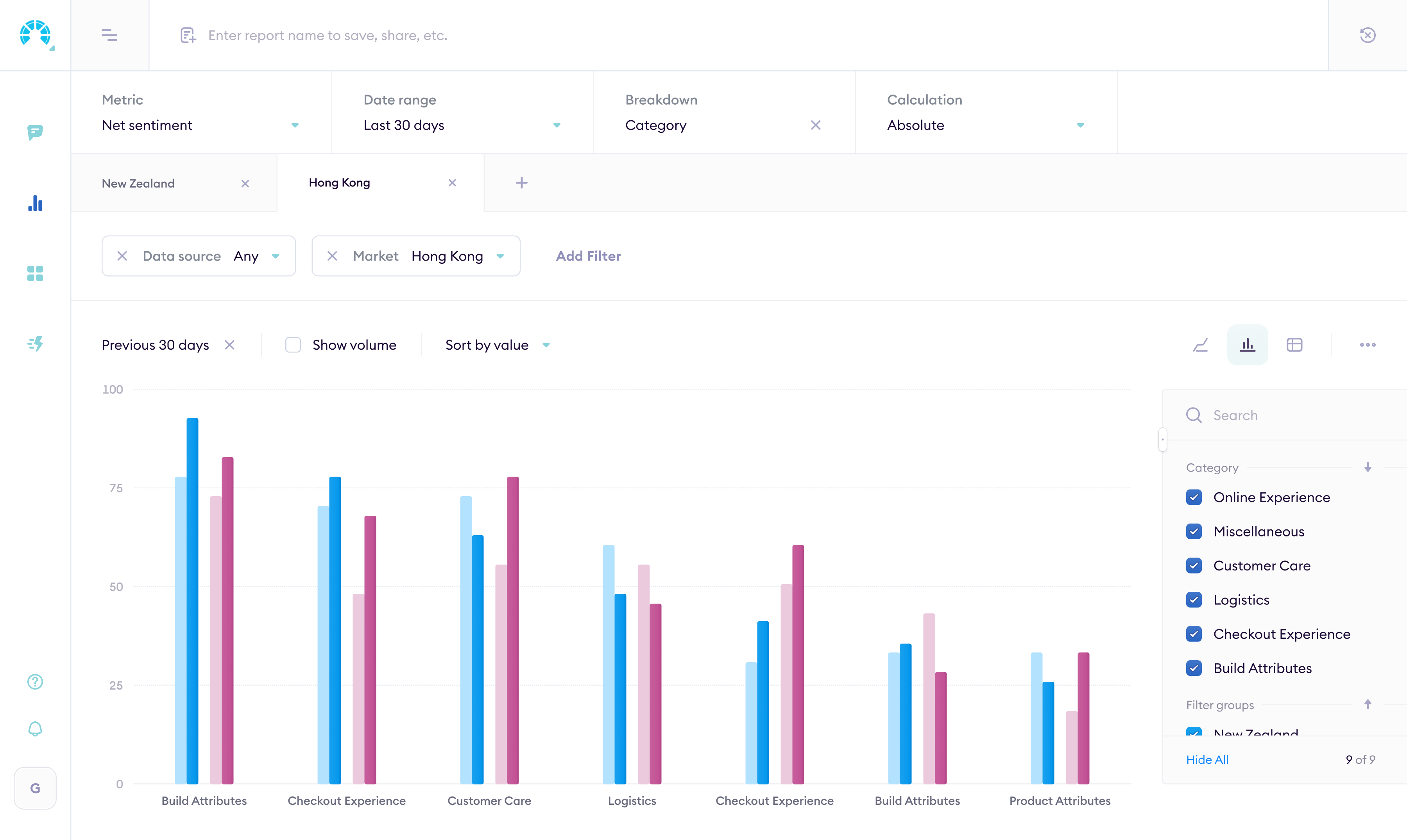
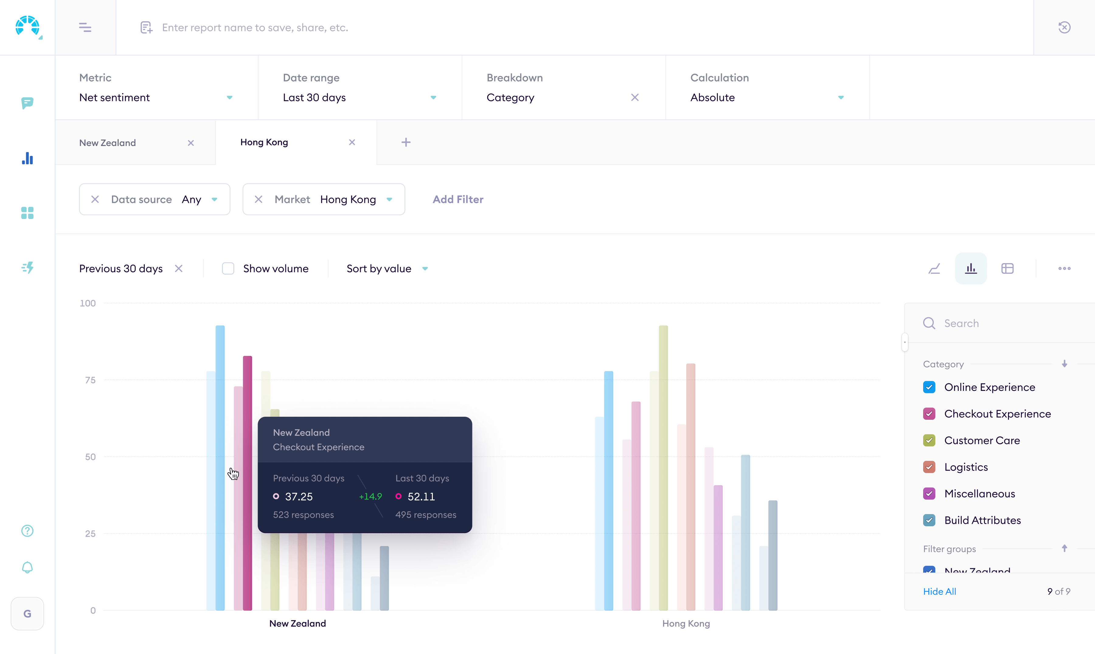
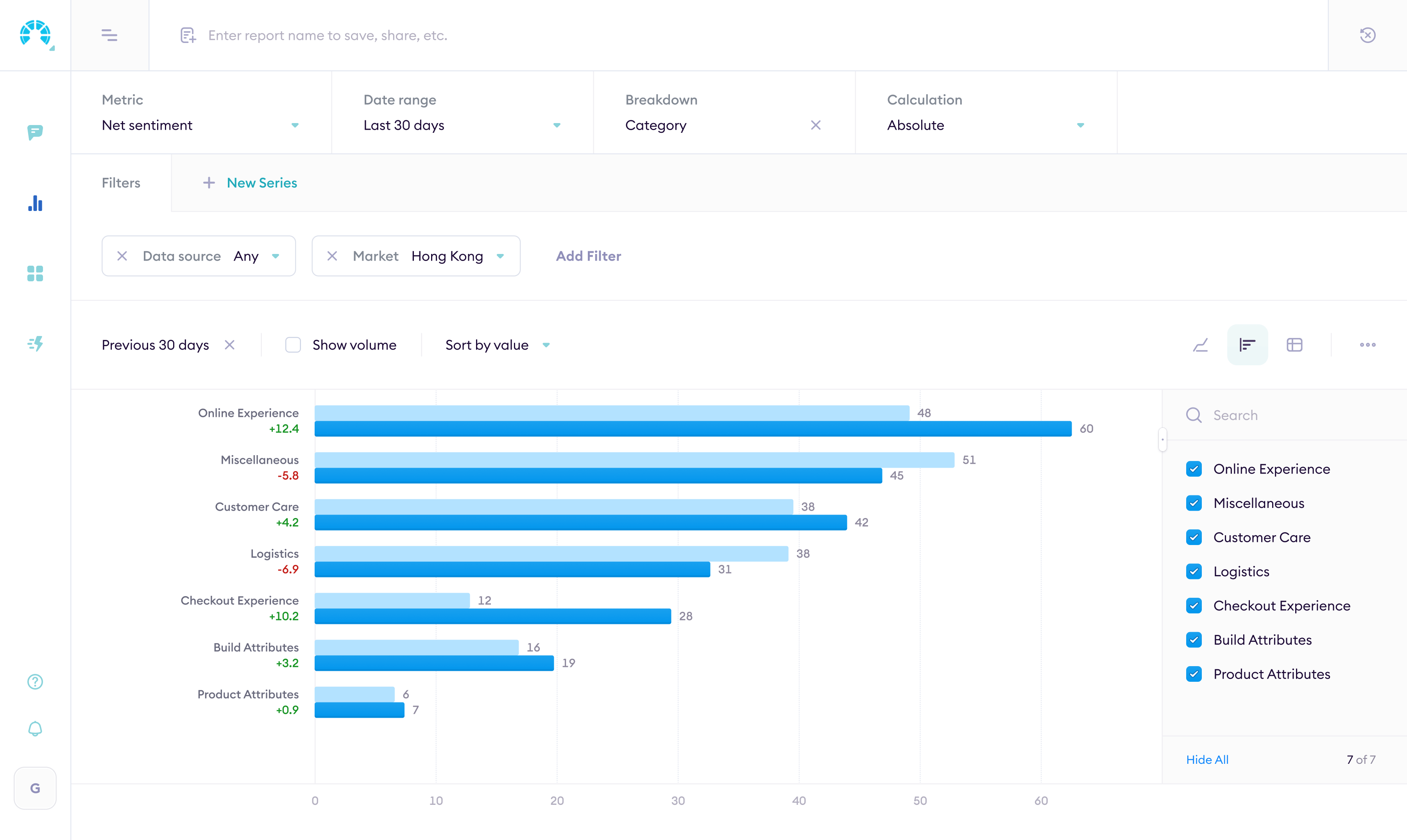
The Analytics page is a report builder. Group metrics by attributes, apply filters, pick a chart type. The data updates live.
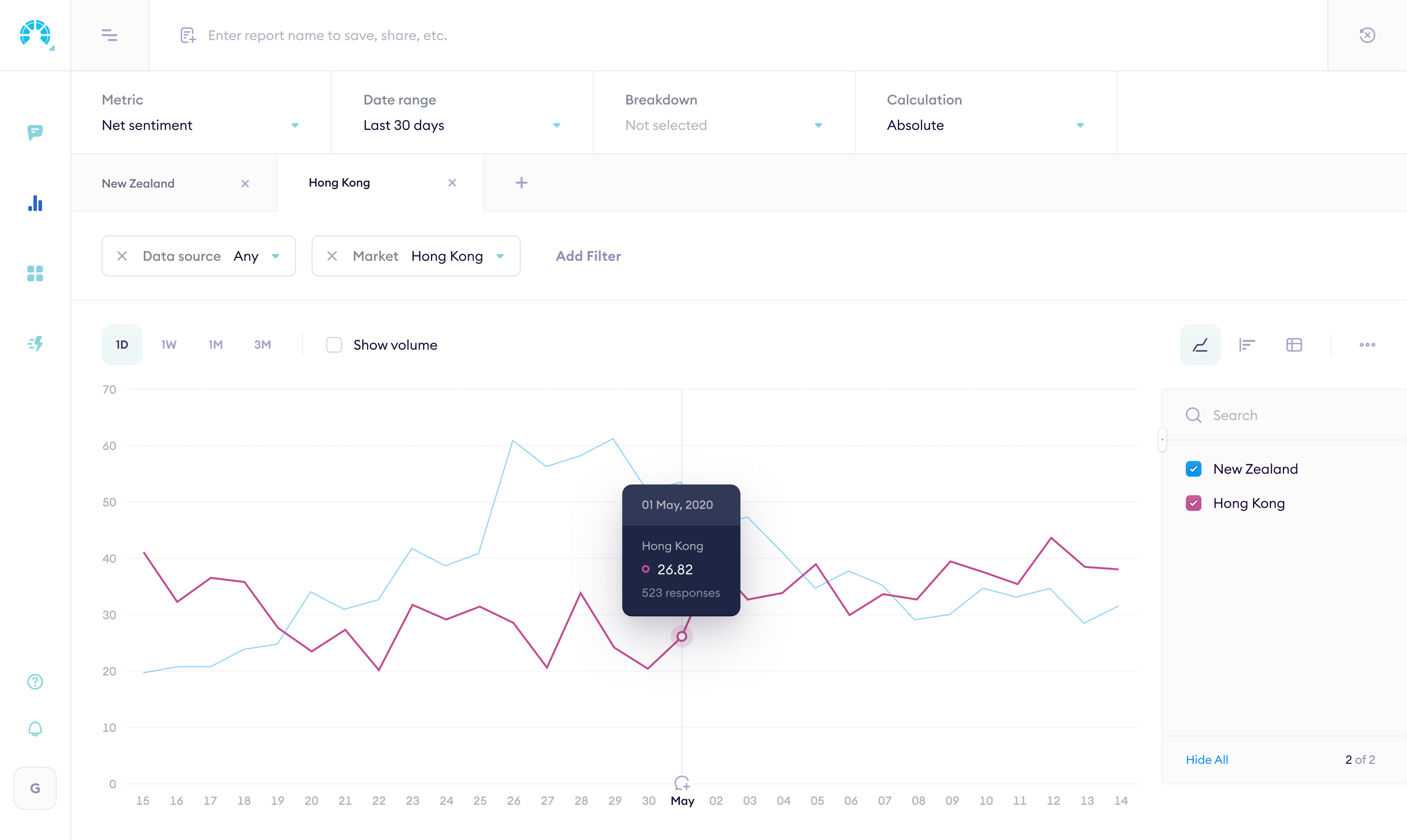
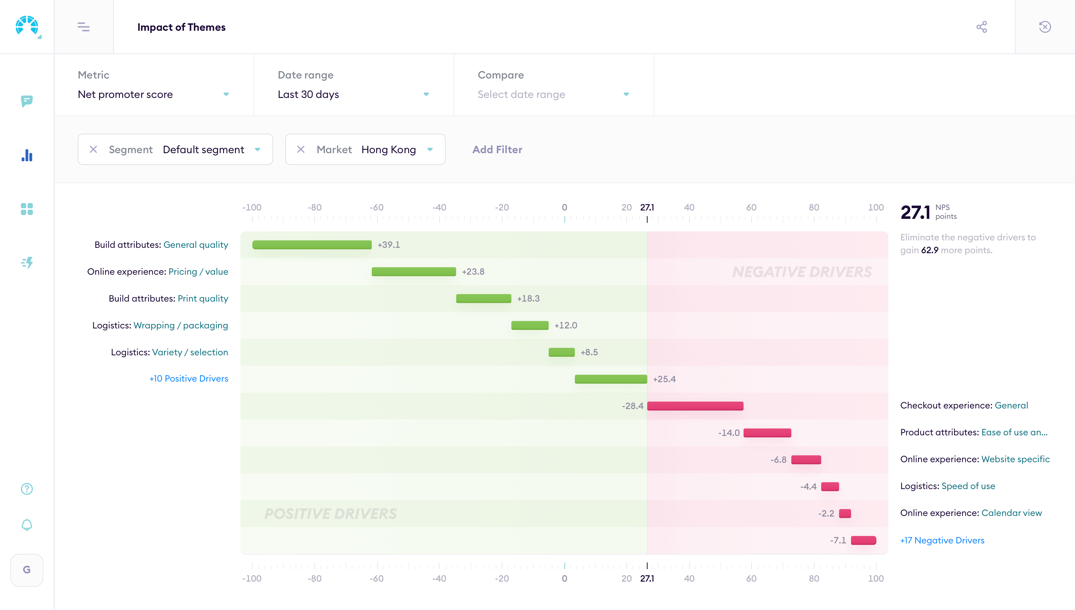
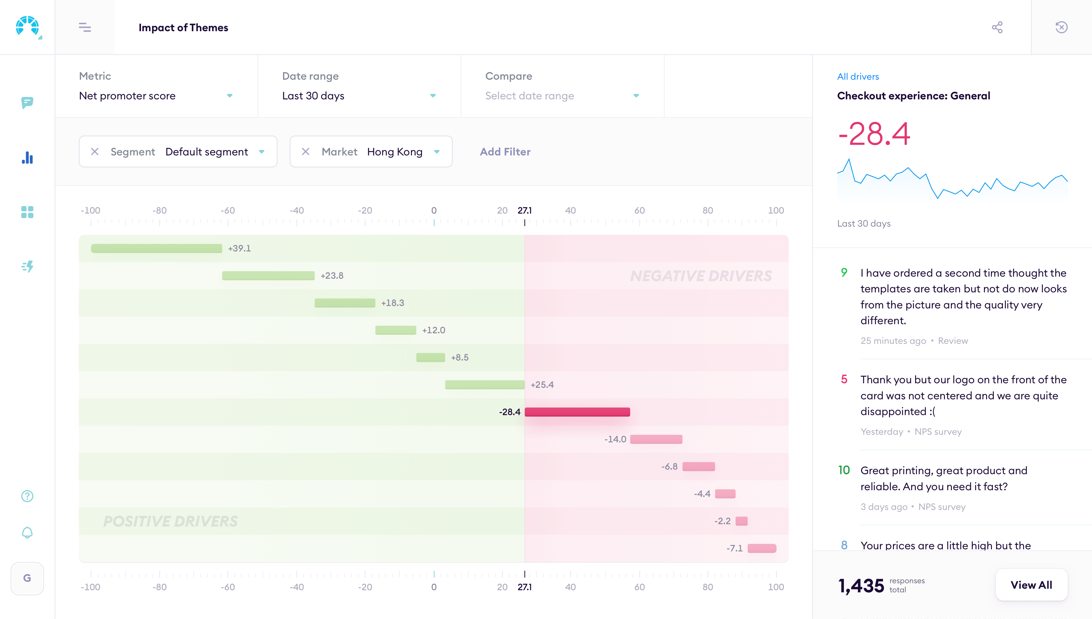
Impact of themes
The Analytics page also has predefined reports. Impact of themes shows which topics in customer reviews drive sentiment up or down, so teams can see what's helping and what's hurting.
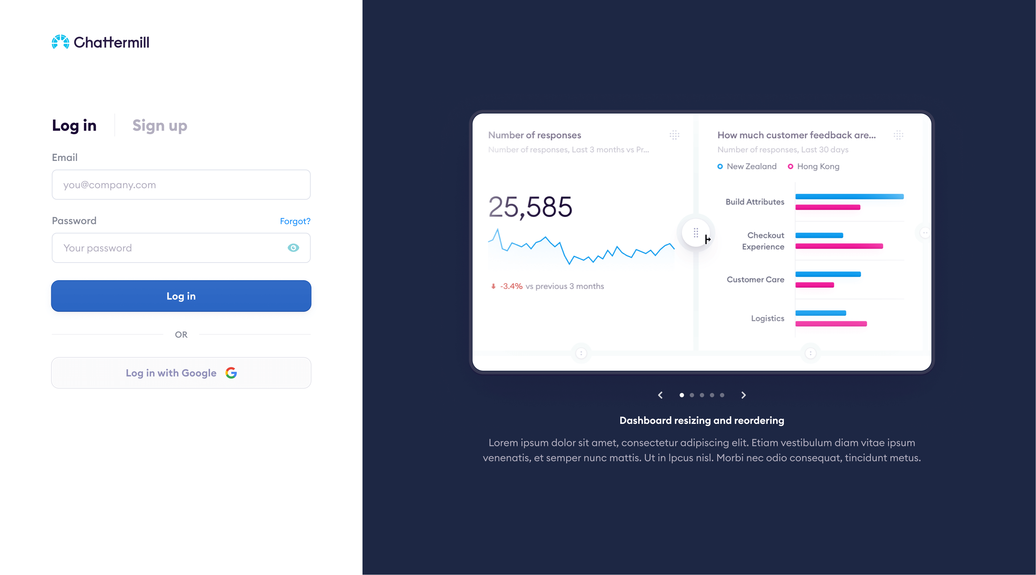
Assembling dashboards
Customers can group any reports into shareable dashboards. Drag widgets in, rearrange, share with the team. One screen shows feedback trends and individual reviews side by side.
The hard part was keeping dashboards readable. Too many charts become noise. I designed the layout so each report reads clearly on its own but the full dashboard tells a coherent story.
Adaptive widgets
The old app had two widget sizes and just stretched chart content proportionally. I redesigned it so charts adapt their content to the widget size: a small widget shows a summary, a large one shows the full breakdown.
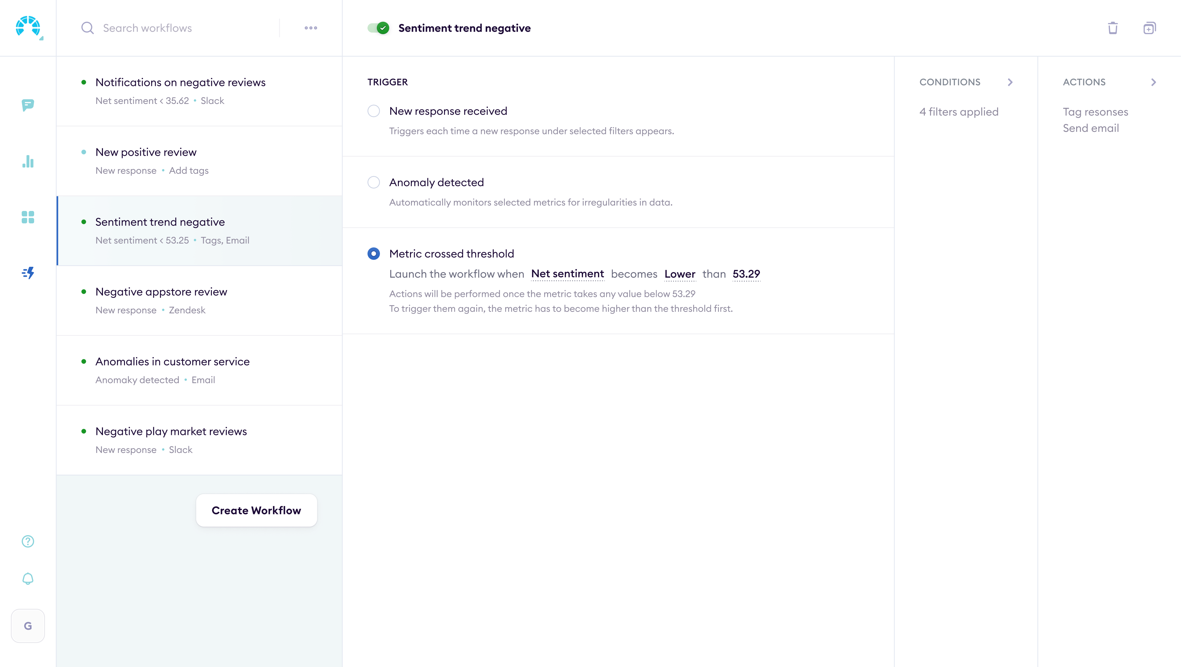
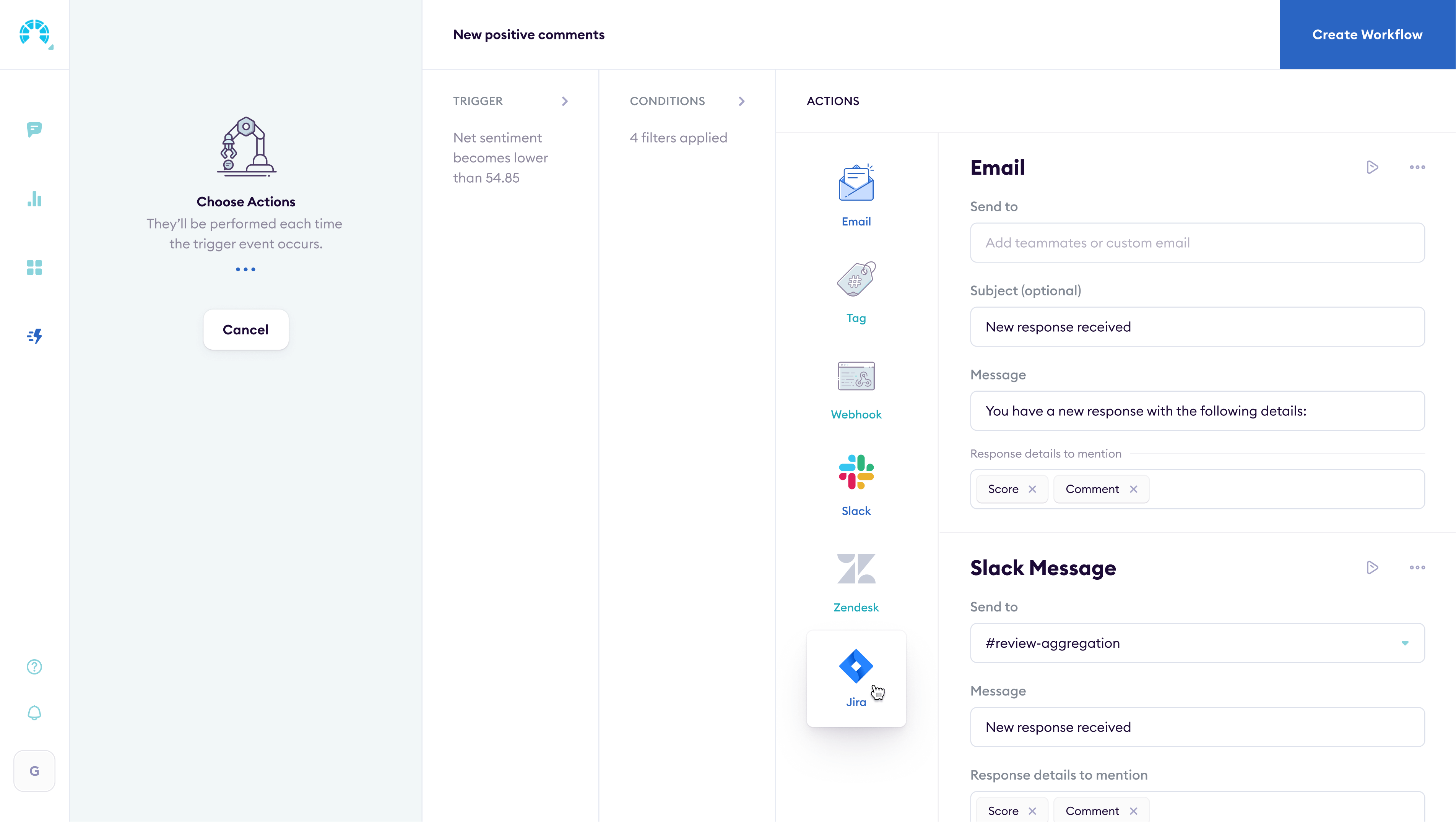
Workflow automation
Seeing a problem in the data is one thing. Doing something about it is another. I designed workflows that trigger actions automatically: send a Slack alert when NPS drops, create a Jira ticket when a theme spikes, push data to a CRM.
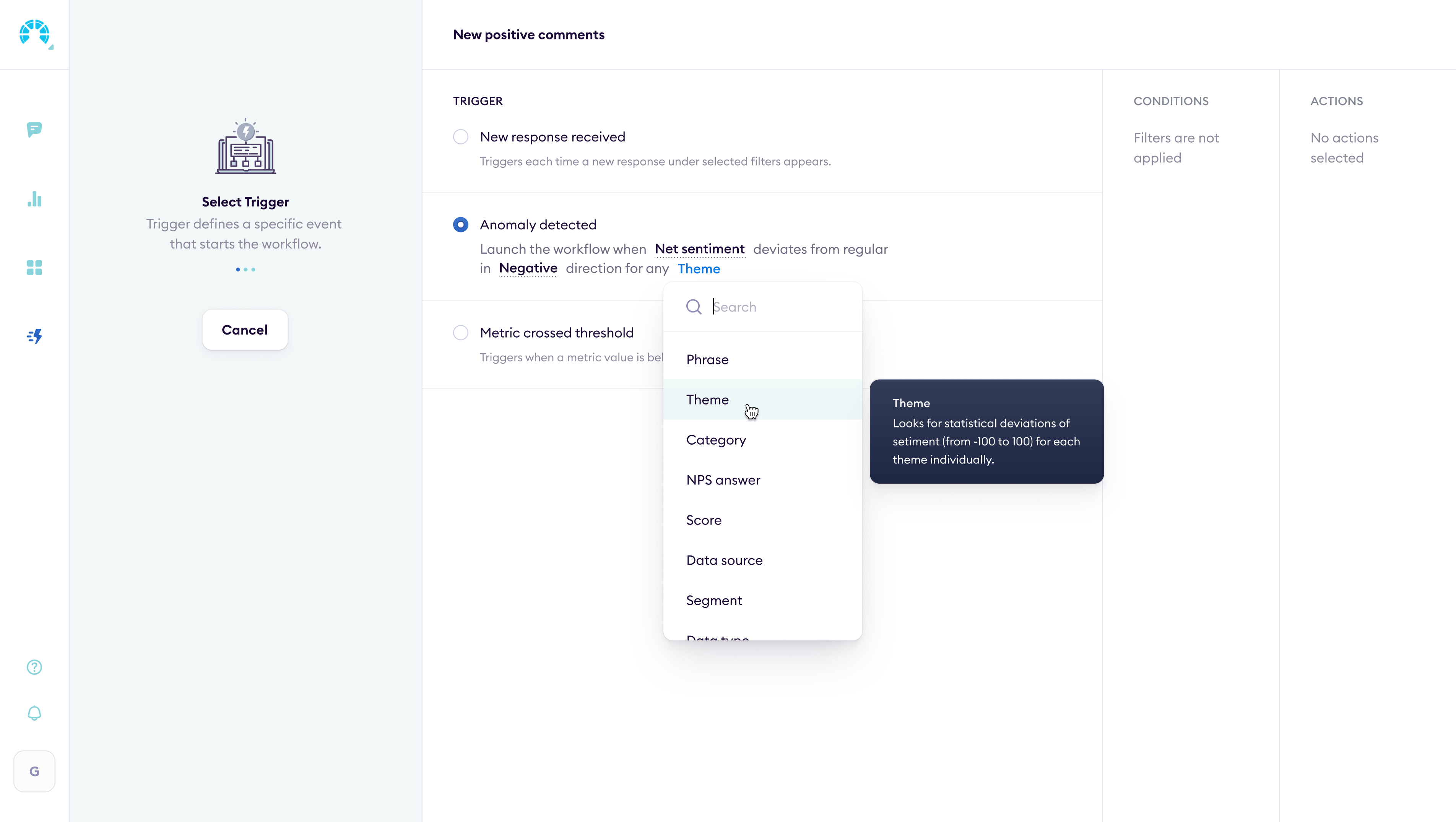
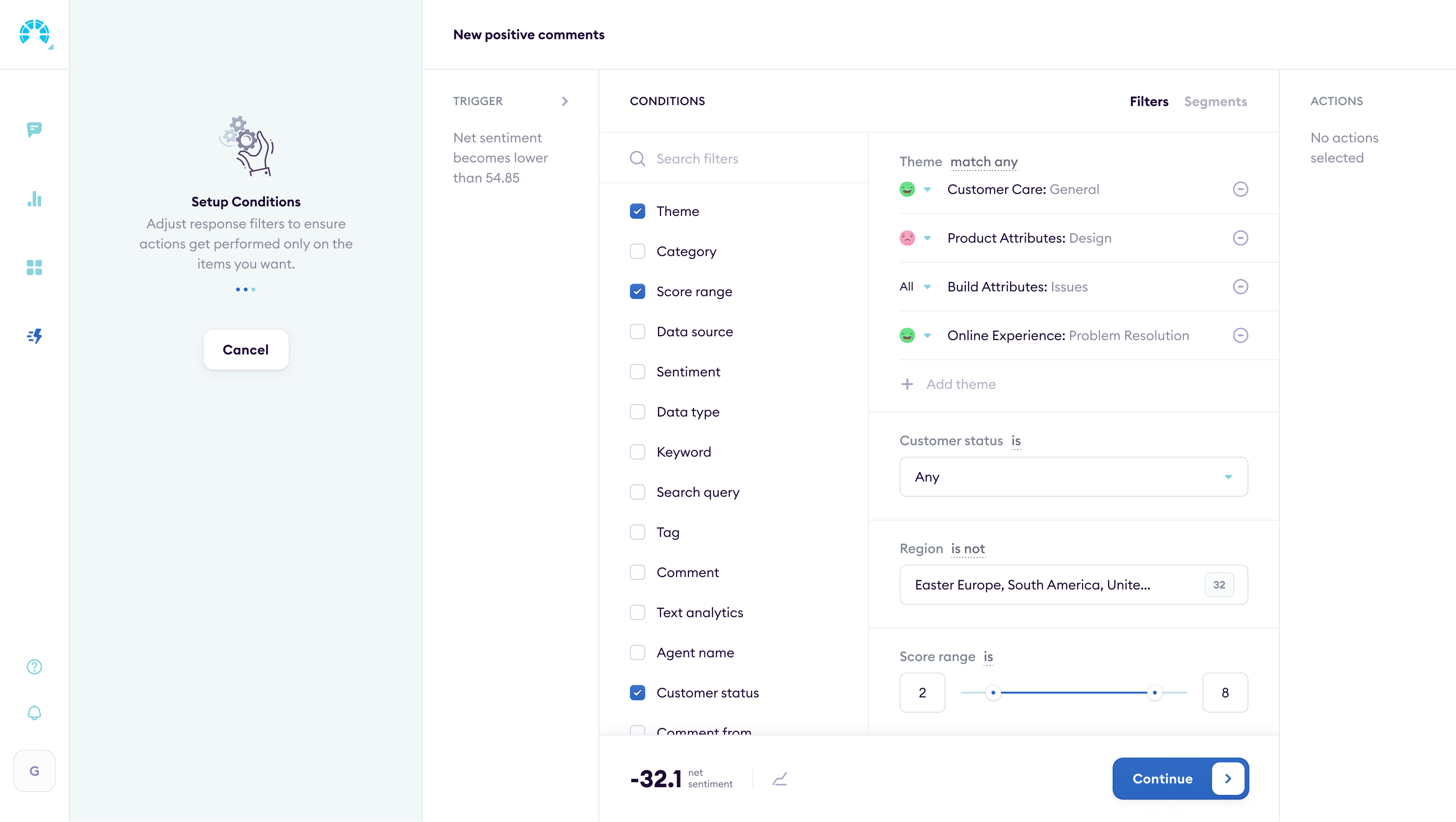
Workflow builder
Each workflow has a trigger, conditions, and actions. Users pick a feedback pattern, set thresholds, and choose what happens next. The builder shows the full chain so nothing fires by surprise.
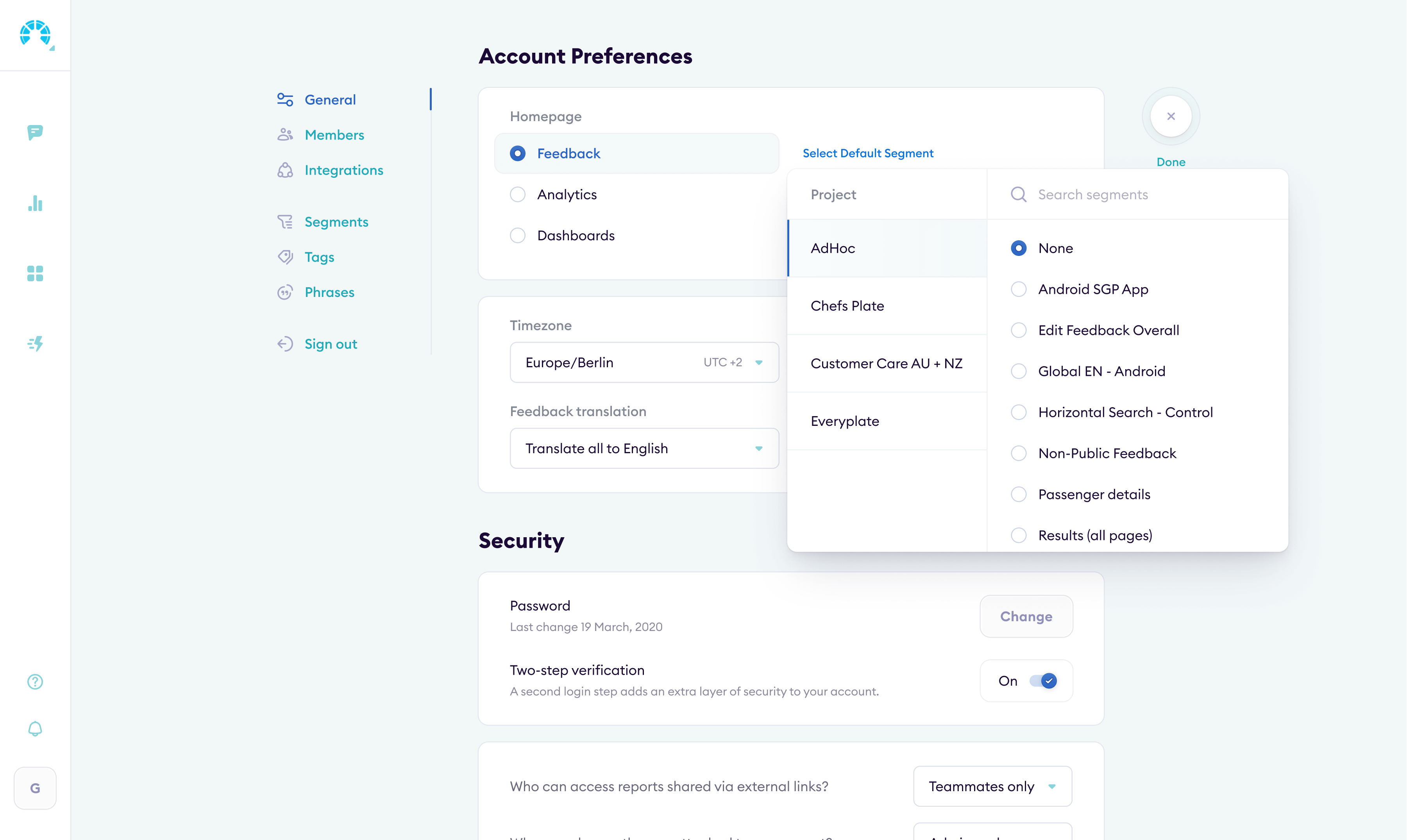
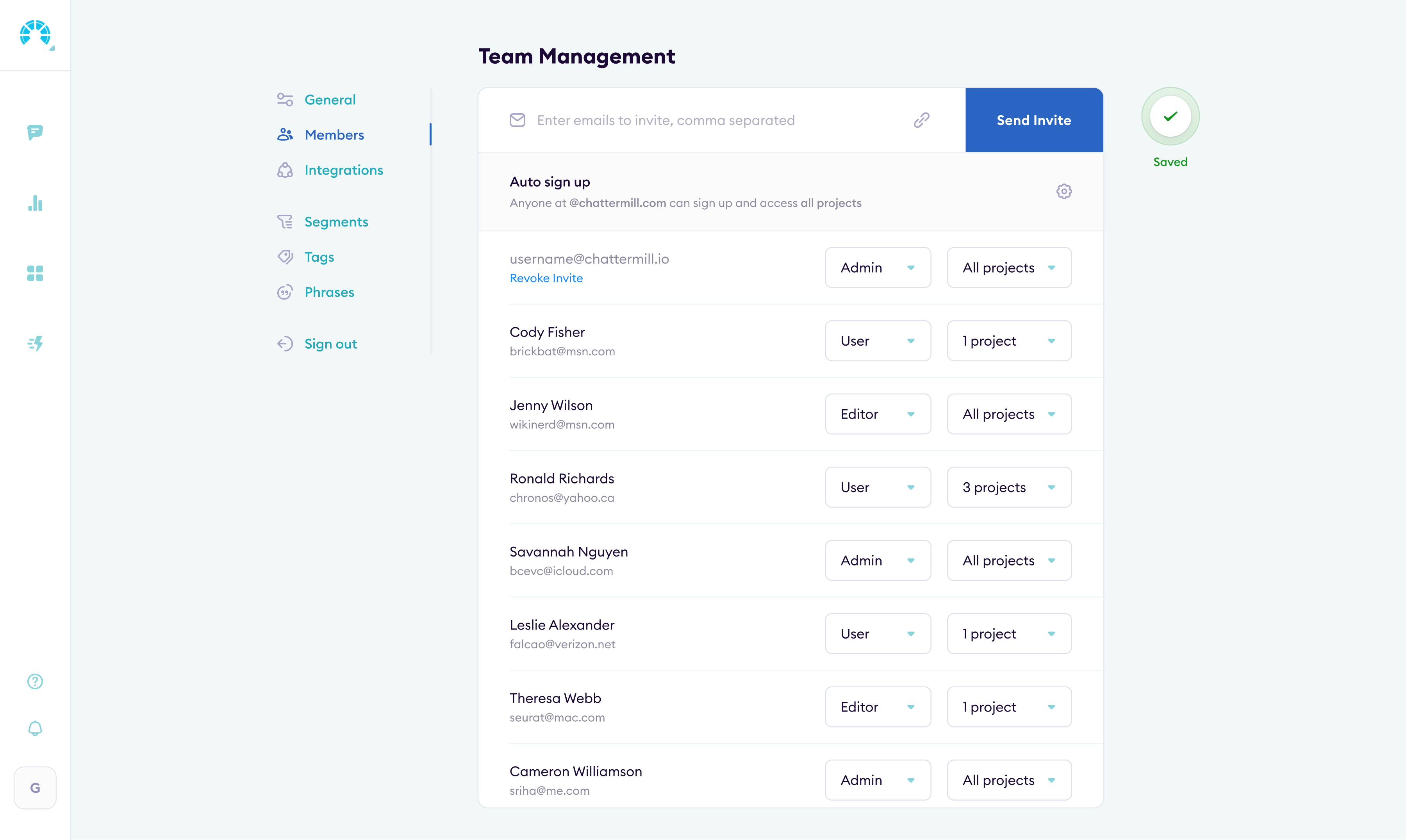
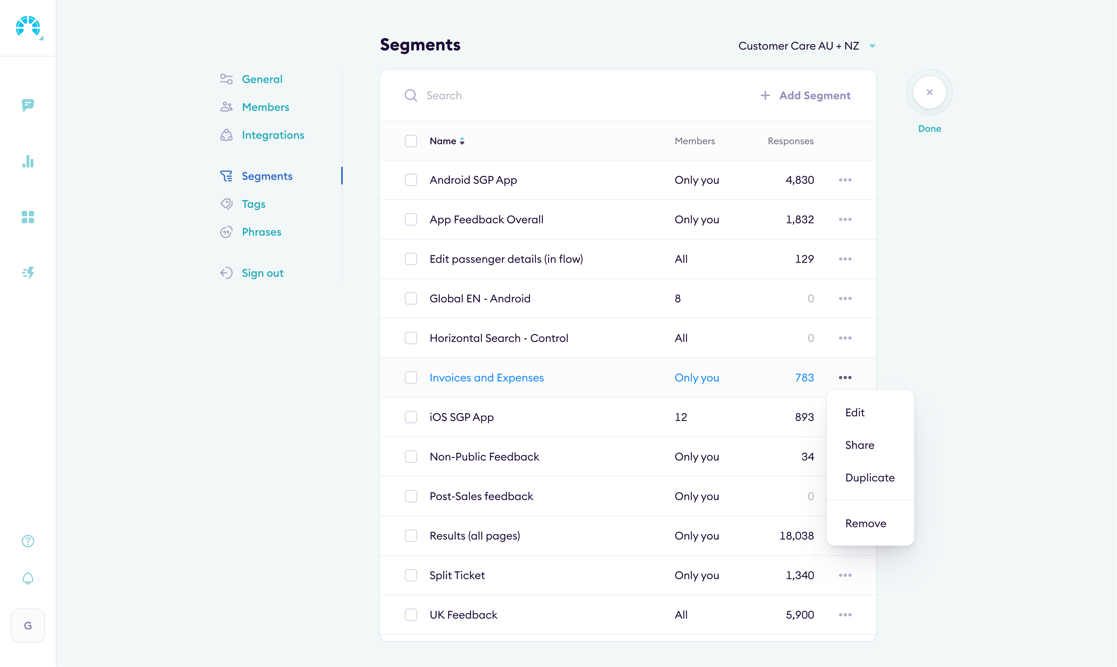
Settings & administration
I restructured settings around how teams actually manage their workspace: integrations, user roles, data sources, billing. Fewer clicks to find what you need.
Outcome
The redesign shipped and the numbers moved. UEQ scores improved across every dimension (scale: −3 to +3). Business metrics followed.
Analysts got saved filters and report templates one click away. Managers could pin dashboards, share them externally, or embed them in Notion.
Review tagging went from manual to mostly automated, and self-serve onboarding replaced live training sessions.
Net Promoter Score went from 53 to 75 after the redesign shipped.
Enterprise prospects started commenting on the interface quality during demos. Conversion went up.
Complaints and bug reports to support dropped sharply after launch.
The redesigned product helped close the Series B round.
Let's see if it's a fit.